Condo Refresh

With summer vacation days coming to a close, condo owners are assessing their rentals and looking to refresh their properties to get more bang for their buck next year.  I don't know about you, but one of the main things I look at when renting a condo (next to location) is the style of the place.  If you're going away, you'd like it to be a place you want to relax, right?  A place you want to spend time.  A place to make you feel like you're on a vacation.  

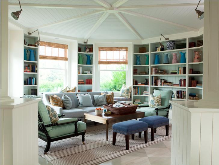
A few design updates can go a long way when sprucing up a condo.  And thinking outside of the coastal cookie cutter box can make your condo stand out among the rest of the competition. 

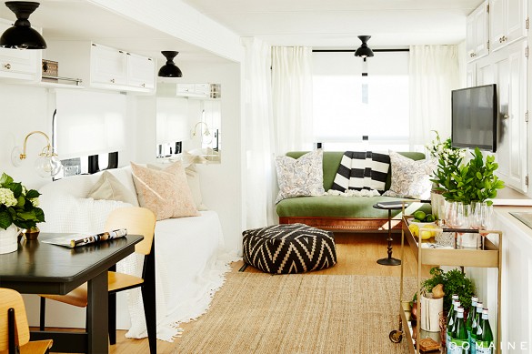
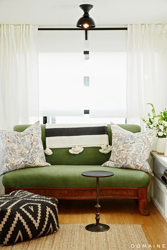
Here a condo E-Design we recently completed.  They didn't need a full overhaul-just a little refresh, and we were more than happy to oblige.

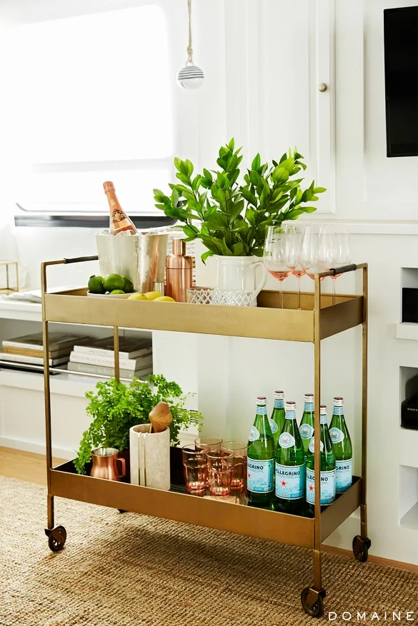
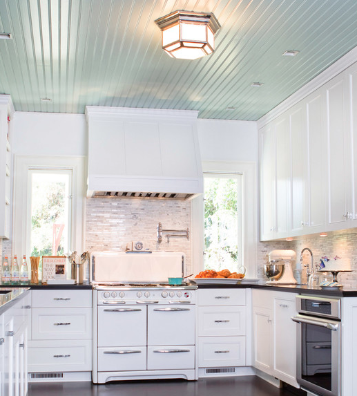
With a great neutral backdrop to start, all we had to do was add in a few new pieces to bring this place back to life.  We suggested updating the kitchen with a new backsplash in these coastal blue arabesque tiles and replacing the existing can lights over the bar with these antique nickel pendants.  Finishing off the updated kitchen, we suggested using these modern, easy to clean acrylic bar stools in lieu of the dated wooden ones they had.

In the living area we added in a durable seagrass rug one size larger than their existing one (scale is huge), brought in some new pillows for their existing slipcovered sofa and added some blue lamps.  The blue color and acrylic base of the lamps tie into the tile and barstools in the adjoining kitchen, and the fabric on the pillows (great for camouflaging stains) has a coral inspired look with a slightly unexpected color palette. Update complete!

If you're looking to update your condo or rental, here are a few things to consider giving a "refresh"--

  • lighting
  • pillows
  • wall paint colors
  • hardware
  • backsplash
  • rugs

And if you have no idea where to start, contact us and read more about our E-Design process here.  We'd love to help!


Client Project - A Farmhouse E-Design

We wrapped up a huge great room design in a beautiful Alabama farmhouse last month and have been dying to share it with you guys.  Dana previewed a little tease of it here, but today we’re showing you the rest.

Our sweet clients had just moved into their new home a couple of weeks before we went for the consultation.  We had seen some photos of the house through email but we couldn’t really get a grasp of its openness and amazing views of their man-made lake and 3 acres below.

Look at that view.  (pardon the boxes and such...they had just moved in)

View standing in the living room and looking back into the kitchen.  Don't you just love all of the openness?

Our clients told us they liked cool, soothing colors and wanted a design that would work with the aesthetic of the farmhouse and also be comfortable and durable for their young family.

We got to work by first selecting new paint colors for the walls and built-ins and then sent over some sofa options.  Due to a long wait time on a custom sofa, the clients ultimately had to select one in town that fit their needs.  We still got to “go shopping” with them virtually and added their newly selected sofa and loveseat to the design foundation.  As you can see below, we also presented them with a couple of options for a coffee table as well.

The entry is right off of the living room so we brought some of the rustic elements and the same color palette to this side of the room.

n the dining room we suggested all new furniture to tie in with the rest of the space.  We chose more colorful window treatments and accessories to bring some life to this side of the room.

We love supplying our clients with not only mood boards and items suggestions but also elevations so they can actually visualize the scale and look of the new pieces in the space.

Directly across from the dining room was an unassigned space where we created a seating area.  The clients had some slipper chairs that they wanted to recover so we supplied fabric and pillow options to complete the look.

BEFORE

BEFORE

Aside from the large great room, we also supplied tile backsplash ideas for the kitchen to be used at a later date and included some suggestions for finishing off their master bedroom. They need bedding suggestions to match their existing duvet and a remedy for covering a mid-height wall outlet.

It was so great to work in a home where we could really tie each room together and supply the homeowners with a look they’ve been hoping to achieve.  We’ve already seen a couple of the progress pictures and can’t wait to see the finished product!

If we can help you finish off a troublesome space (or spaces), please let us know!  Whether it's a few styling suggestions and paint colors or a newly designed room, we can help.  Go here and fill out our design questionnaire at the bottom of the page to begin.

California Layered Living Room E-Design

A couple of months ago, we launched a survey for our clients and readers. One of the questions we asked was "What room in your home would you most likely redo using our E-Design service?"

Even with nine other room options, the Living Room won out with over 50% of the results.

It makes sense.  This is the room where people typically spend most of their time at home.  It is the center of the home.  So naturally, you'd want that room to feel the best, right?  You'd want it to be stylish, comfortable and most importantly, like "you."

We recently completed a living room design for a family in California.  They had some great pieces (and style) to start but needed our help with some big ticket items, paint and accessories.

We created a relaxed, layered look to go with their eclectic style and love the way it turned out.  We started with a large sisal rug to anchor the space and topped with a softer, more colorful dhurrie.  We brought in a classic sofa and some large textured lamps for the iron console.  We added some more color and pattern with new toss pillows and a throw.

layered eclectic california living room mood board e-design 3adesignstudio

lamps // mirror // paint // lattice pillow // stripe pillow // console // throw // side table // sofa // sisal rug // dhurrie rug

I fell in love with the leather topped side table when I first saw it in the Manhattan apartment of Casey Smith on Domaine Home and have been waiting for the perfect home to get to use it.  

I think the design turned out to be a pretty cool space that I would love to hang out myself, and hopefully this family will get to enjoy their living room even more now!

If you have a space in your home in need of a little help (it doesn't have to be a full makeover--that's the beauty of design), drop us a line.  We'd be glad to help!

Before and After of Ellen Pompeo's Trailer

I am a real sucker for "Before and Afters".  There's just something so inspiring about seeing a space brought back to life.  And the best part is that most of the time, the transformation doesn't require that much.  If you enlist the help of a designer, you can get your money back ten-fold in the result.  Designing is what we do for a living.  This is how we think.  You wouldn't go to the doctor for a hair color would you?  No, you go to the people with the right knowledge to get you the right results.  If you can relinquish some control and ask the professionals, you can end up with a room that you'll love!  Okay, enough about that.  Let's take a look at this fabulous makeover that got me all fired up!  

This trailer belongs to actress Ellen Pompeo from Grey's Anatomy.  Prior to breathing new life into the space, Ellen commented that the trailer was "depressing," not the adjective you want to  describe where you spend most of your time.  Your home (or in her case, home away from home) is supposed to be your place of rest, relaxation and happiness so don't settle for a place that you don't enjoy!  That's what Pompeo decided when she enlisted the help of celebrity interior designers Mat Sanders and Estee Stanley, from Domain Home.  The amazing results speak for themselves.

DINING ROOM BEFORE

DINING ROOM BEFORE

DINING ROOM AFTER

DINING ROOM AFTER

The whole trailer was painted in Ralph Lauren Paint Starch (#RL1066) by Home Depot.  The new, light and bright walls truly woke up the space.  This is yet another example of how a simple paint job can truly transform a room.

LIVING AREA BEFORE

LIVING AREA BEFORE

LIVING AREA AFTER

LIVING AREA AFTER

Lighting is also another way to make a great impact.  These black porcelain ones from School House Electric were the perfect update for the tired, old fixtures.

I also love the bar cart they brought in.  Here's another closeup shot of it.  If you follow our blog regularly, you know I love a beautifully styled bar cart (as discussed here) so this one did not disappoint.  

That green velvet settee really got me too.  It reminds me of the green velvet sofa I have in Auden's nursery. And that stripe tassel throw isn't so bad either.  

BEDROOM BEFORE

BEDROOM BEFORE

BEDROOM AFTER

BEDROOM AFTER

It's a beautiful new space isn't it?  For all of the details on Pompeo's trailer as well as where to get the items you see, go here.  Many of the items were very budget-friendly.  And thankfully, Domain Home is always so great to list their sources.

If you have a space that could use a makeover, let us know how we can help!  Our E-Design process is so easy...and Christmas is right around the corner.  A new room would make a great gift for yourself, your family or your spouse! 


Client Project Before and After-Styling Bookshelves

Last month Dana and I headed up to Homewood, AL, to do an in-home style consultation for one of our sweet clients.  Our client had already received one of our E-Designs for her living room and was well on her way to putting all of the pieces together.  But one thing in the room kept stumping her--the bookshelves.  

She had not one, but three built-in bookcases in her living room--I know, we're all a little jealous.  She also had a great assortment of accessories, collectables and frames to help fill them.  The problem came when figuring out where to place everything.  

Styling bookshelves is definitely an art.  Even the most keen eye will move pieces around several times before stepping back and looking to see if it is just the way they want it.  This was something the homeowner had done several times but had yet to figure out the puzzle.  She needed our help, and we were thrilled to give it.

She did a great job with two of the built-ins but wasn't fully satisfied with the outcome...and she didn't even know where to begin on the third one--the deepest one of the them all.

We honestly have to say that she did a really great job.  Two of the bookshelves were almost "complete," but they still had a few little problem areas.  A few of the shelves were still empty or didn't showcase the pieces like she wanted, there was little red (a color that needed to be added to balance out the rest of the room) and all of the remaining accessories weren't right for the third, incomplete shelves.

We began by tackling the most difficult bookcase first, the deep one next to the fireplace.  Once we got things looking good in there, we knew we would be golden with the other two.  We spread out the red accessories among all of the shelves so that one side of the room wasn't weighted in turquoise and showcased her prized possessions were they could all be seen.  A couple of hours (and a lot of chatting--we seriously have the best clients) later, we were done.  Here are a few before and after shots (please excuse the lighting--it was dark by the time we finished).

Bookcase one with the deepest shelves. 

Bookcase two.  The fish floats are a favorite of the clients so we moved them to eye level on the deep shelf for everyone to see. 

Case three.  

What do you think?  Just a little rearranging can go a long way, huh?  We loved the final outcome and so did our client.  After leaving she sent us a text saying "I can't stop looking at them.  Thank you!  Thank you!"  I'd say that was a success!  We love what we do--especially when doing our job makes you love your home even more.  Contact us today and let us know how we can help you---no project is too big or too small!

In closing, I have to say that last bookcase is my favorite.  Which one is your favorite--1, 2 or 3?  


Client Collaboration

As designers, we get a wide variety of clients.  Some of them need a lot of assistance, some need to know how to make their already great pieces work in their space and some just want the finishing touches to make their home beautiful.  We love getting to work with each kind, but the best kind, in any situation, is when we can use our knowledge and expertise and mold it with the client's dreams and wishes to create some amazing.  

Sometimes we have all of the answers right away and sometimes there's some back and forth where we need to learn more about the client, their home and what exactly they desire.  Design is ALWAYS an evolving process and almost always involves some sort of detour.  But often, it's in the detours that you find something beautiful that you never considered before.  That's what happened recently with a client of ours in Seattle.

We were working on their living room and suggested painting their gold toned walls a lighter, gray to help neutralize and brighten up the space.  Their ceilings were also in the gold color so we obviously suggested those be painted as well--in white, to light the room and lift the space.  Well, we soon learned that the client's husband wasn't fan of white ceilings (some times you just can't know it all from the start!), so we were back at square one.  The ceilings had a continuous flow from room to room so a single color would still be necessary to keep a good flow.  The question was "What color?"  That's when our client had an "ah ha" moment and thought "What if we paint them light blue?!"  She quickly added a light blue swatch to ceiling next to the potential gray wall color already in place and sent the mockup our way along with a few real room images as a visual to see what we thought.

Click on image for source

Click on image for source

We were immediately in love with the look!  And the fact that the client was able to marry our thoughts with a new idea to create something neither of us would have considered at the start, made it even better!  That is where the best designs live in my opinion.  

Click image for source

Click image for source

I've always loved painted ceilings (especially on porches) and can't wait to see how this one will turn out!  I think it will work so well in their 1960's home that they have labored on for several years to make so beautiful.  We are just so grateful that they trusted us to be a part of the process!

In closing, here are a few more light blue ceilings to get you salivating :)

Click image for source

Click image for source

Click on image for source

Click on image for source

Click image for source

Click image for source

Click image for source

Click image for source

How can we collaborate with you on your next project?  Contact us today.

signature Mallory.png