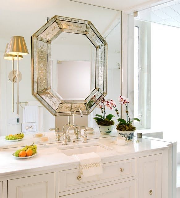
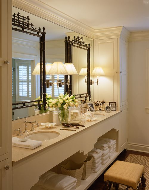
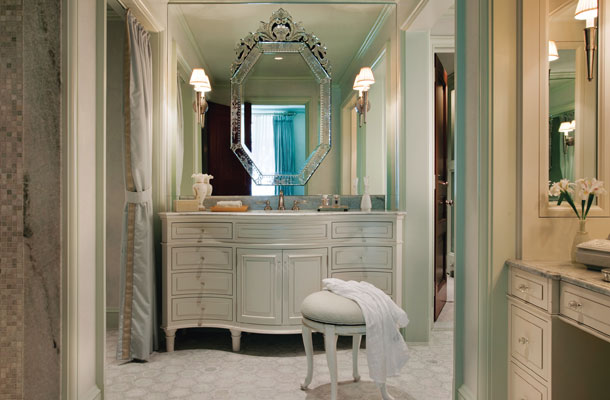
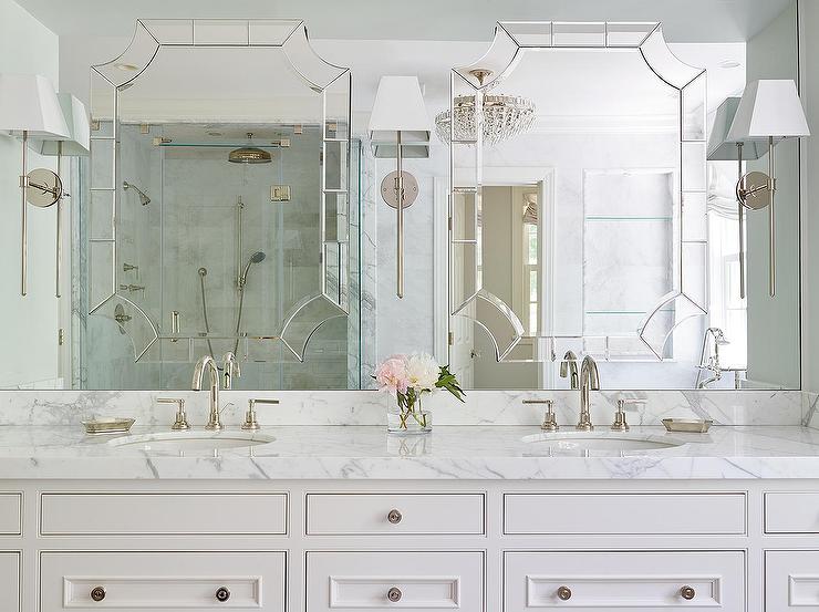
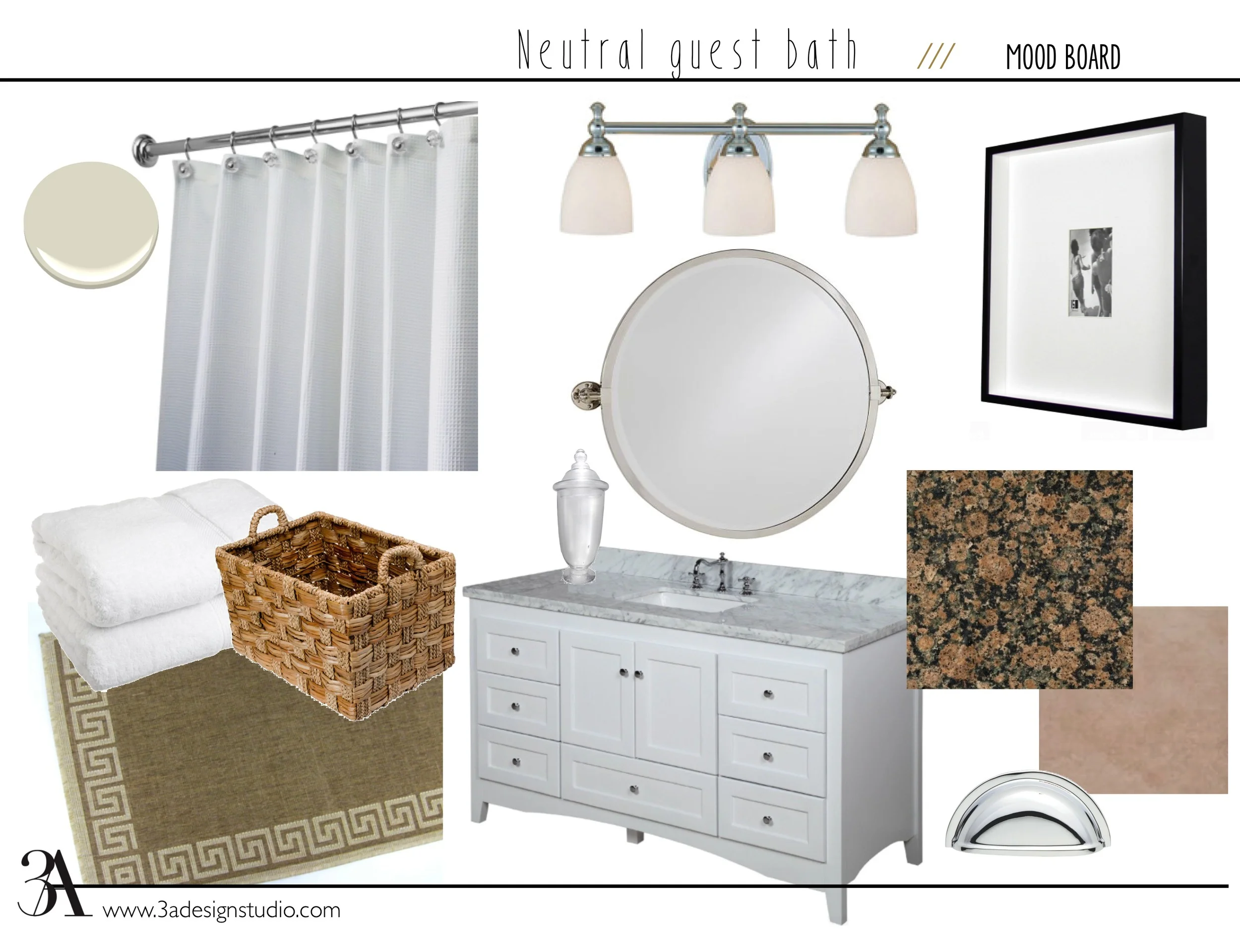
A Tale of Two Baths

In the second installment of a "Tale of Two..." we're featuring two bath designs we recently completed for a client new build.  Unlike our last client in the "tale of two kitchens," this family was able to nail down a favorite.  But in the interest of showing you a bit more of our process and this gorgeous bath (if we do say so ourselves), we thought we'd share the two options with you.    

boothbay gray bathroom edesign mood board 3a design studio

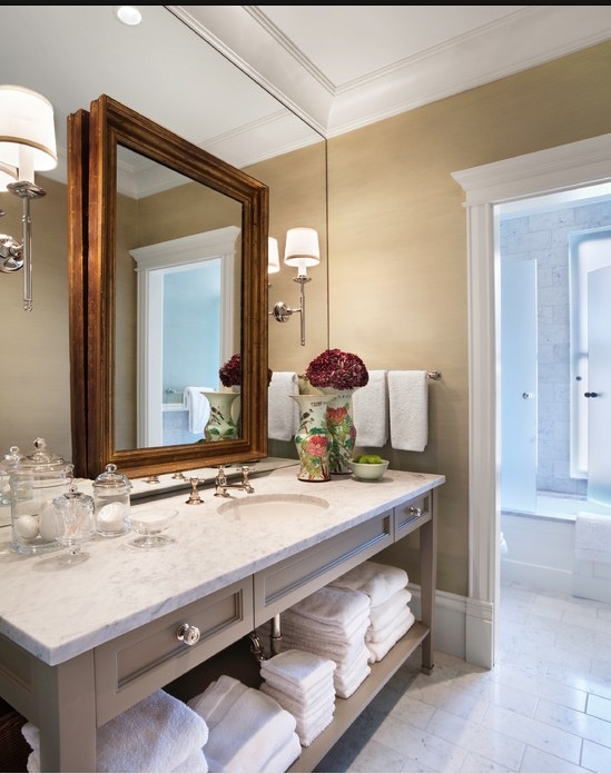
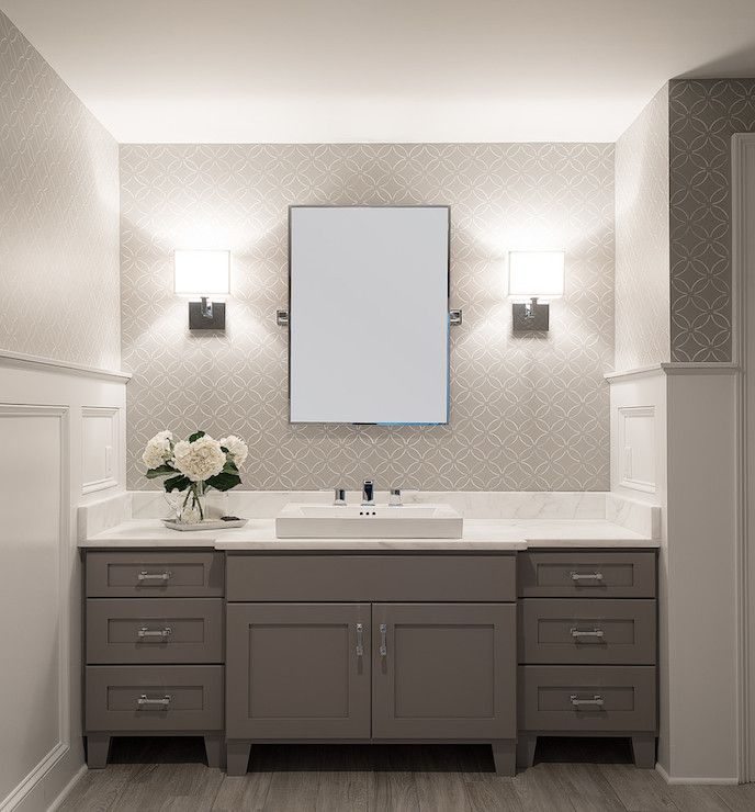
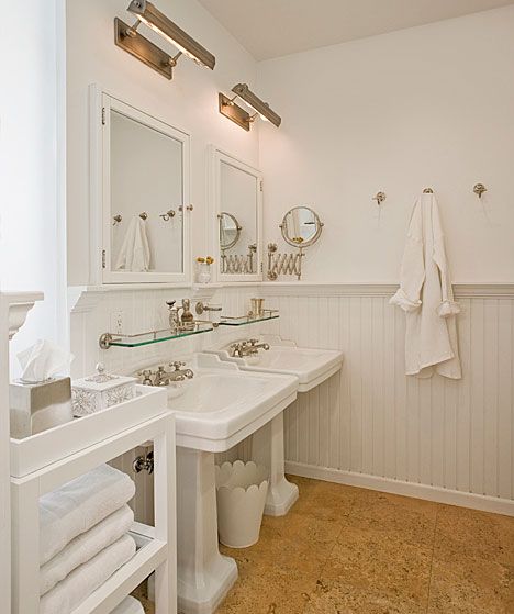
Option A features cabinets painted in Benjamin Moore's Boothbay Gray (HC-165) with matte black hardware and porcelain floors that mimic marble without all of the upkeep.  Two different light fixture options with natural wood accents were given for hanging above the fabulous soaking tub.

lamp room gray farrow and ball bathroom edesign mood board 3a design studio

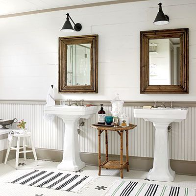
Option B had the same tile but a different vanity color (Lamp Room Gray by Farrow & Ball) with a lighter option of wood mirrors with satin nickel hardware.  As with Option A, two different ceiling lights were given to leave the client with the final decision. 

Many times, we supply our clients with a couple of perfectly great options and give them the freedom to "pull the trigger" so to speak on the option they gravitate toward the most.  We've found that while most clients come to us feeling lost or overwhelmed with a space, they still want to feel a part of the process in the end.  Narrowing down some choices but leaving the final decision with them, is a great way to not only give them confidence but to also help them feel invested in the space---after all, it is their home.  We love that part of our job!

With these baths, we didn't think the client could go wrong with either option (obviously we had a hard time picking a favorite ourselves), but which one would you choose for your home?  Comment below and tell us which one "speaks" to you. 

We'll have more designs from this beautiful home coming up soon.  Stayed tuned!

Mirror, mirror on the wall

Large wall mirrors can make a bathroom feel bigger but they tend to be pretty boring. If you are like the many who have these ubiquitous mirrors and have been considering ripping them out, try layering a decorative mirror on top. It elevates the look without breaking up the expansive feel that the larger mirror provides. Plus, it saves you from needing sheet rock repair work.

The images below take it a step further by installing sconces on top of the wall mirror as well. Not only does it make it more interesting, but it reflects more light into the room.

Source unknown

Source unknown

Source unknown

Source unknown

A Guest Bath - The Plan

Since we moved into our home almost two years ago now, we've painted every bedroom but the master and every bathroom but one.  One of the bathrooms that recently get painted was our main guest bath.  It is one of the baths right off of our living room but also is a part of the guest suite area we have at the back of our house.  Needless to say, it gets a lot of use.

When we first moved in, this is how it looked:

475422_10101061326016225_154636942_o.jpg

No, it's not horrible, but it's not my style either so I knew immediately some things would be changing.  Here was my initial to do list:

  1. Replace shower curtain
  2. Update dinky hardware
  3. Add rug
  4. Add baskets and towels in empty vanity cubbies
  5. Paint walls
  6. Replace mirror
A Before and After of number 2 on the list.

A Before and After of number 2 on the list.

Here's a shot with the updated hardware, baskets and rug.

Here's a shot with the updated hardware, baskets and rug.

Numbers 1-5 are complete and surprisingly almost in that exact order, but number 6 has been a problem.  I knew I wanted to replace that mirror since the day I stepped into that bathroom, and here I am two years later still looking for the perfect one (in my budget).  

Here's a shot of the room prior to painting.  

Here's a shot of the room prior to painting.  

The room looks much better with the mirror gone doesn't it?  I've since painted the space Benjamin Moore's Windsbreath.  I love the color and did sample it on the walls (next to the white beadboard), but I'm not pleased with the final look.  It makes the tan builder tile look even more blah so I'm afraid I'm going to have to repaint (haven't told the husband) in something with a little more gray in it, maybe Edgecomb Gray.  I want to keep it light because the only natural light in the space is from three small transom windows on the door leading out to the pool area (to the left in this picture).    

Until the repainting gets done, I have my sights on finally getting a new mirror.  I decided I wanted a round one to break up all of the squared lines in the room and found one in the perfect size (we need something large for the longer vanity length) and perfect finish from Pottery Barn.  It is more than I'd like to spend, but I'm so tired of searching, I don't even care at this point. 

I think it will dress up the space a bit and finally rid the room of the brown wars (granite, mirror, floor tile, shower tile, etc.) Here it is with all of the other elements in the room.  

Neutral Guest Bath Mood Board 3A Design Studio.jpg

Such an improvement!  I can't wait to finally finish this space!...then it's on the to the next thing...the house of a designer is never finished!


Gray Master Bath - Before and After

As I mentioned to you guys a couple of weeks ago, I've been wanting to paint our master bathroom for well over a year.  Well friends, it's finally happened!  The hubby and I tag-teamed it yesterday and got it done.  I don't know why we waited so long!  

IMG_7000.JPG

Thankfully my in-laws watched the little one so we could focus and get it done with few distractions.  It took us less than four hours (not counting drying time between coats), and I am oh so happy with the outcome!  The color I chose was Mountain Smoke by Valspar.  Here's some proof on how much a can of paint can really transform a room!

Before:

If you look at the area between the mirror and the window, you can see a bit of the faux finish previously there.

If you look at the area between the mirror and the window, you can see a bit of the faux finish previously there.

After:

IMG_7007.JPG
Valspar Mountain Smoke 4

I absolutely love how the gray paint immediately elevated the look of the tiles and the space.  It looks so much more put together and sophisticated (and no more faux finish!).  The previous green did little to compliment the existing tile, but now the color pics up on the veins that run through it. And despite the walls being a darker color, everything looks more crisp and bright in there now.  I'll be honest.  This would not be my first choice in tile, but I wasn't going to spend lots of money on something new, so I had to work with it.  And I think the gray was definitely the best choice. 

IMG_7001.JPG

All day yesterday I kept telling Jon "I love it!  What a change!  I'm so glad we did this!"  It's been while since I've been that ecstatic about a paint job.  And he likes the final outcome too (which is good since he did a lot of the painting!).  Overall, I couldn't be happier with our $65 project (including the paint rod extender).  My master bath finally feels just as it should!

I'll leave you with one more before and after shot for comparison:

Gray bathroom

Are there any projects that you've been procrastinating on?

A Gray Bath - The Before

I've been told that you know a good hair dresser when you see one whose roots need a touchup.  They are so busy with clientele that they don't even have time to do their own.  I'd like to think the same can be said for designers...or at least ones who haven't hit the motherload yet.  If I had tens of thousands of dollars coming in every month, I could just hire someone to finish the areas of my house I'm not finished with yet.  But alas, I don't.  Which may or may not mean I have paint swatches on the wall in two rooms of my home for months. 

Confession:  I've had paint swatches on my master bathroom walls for over a YEAR.  Cue the gasp.  I'd like to blame part of that on finding out I was with child a week after those swatches went up. BUT now my baby is 8 months old.  I must find time to get to it.  Even if that means dropping the Little off at the in-laws for a few hours so momma can paint with no interruptions.  And I'm thinking next week might be the prime time.

The current walls have a beige base with a moss green faux finish on top.  I'm not saying all faux finished walls are a bad idea, but most "Hey, I could totally sponge paint that wall!" moments are.  The previous owners of this house must have had one of those moments.

324218_10101061328151945_1750149728_o.jpg
220664_10101061324753755_507783714_o.jpg

It's a little hard to tell from the above images so here's a closeup. 

IMG_6971.JPG

Our bedroom walls are a soft taupe, and our room is filled with all neutral pieces.  Since our tile is already neutral as well (and there's a lot of it), I'd like to add a little contrast with the paint and go gray.  This room if very open and gets a lot of light so going darker is not an issue, especially since a good half of the room is covered in tile anyway.  

266358_10101061324873515_464307686_o.jpg

I helped my mom redo her dining room a few years ago and absolutely fell in the love with the gray paint we used on the walls.  Just to be sure though, I purchased a sample of it (Mountain Smoke by Valspar) along with another gray to see which I preferred best.  Mountain Smoke was the obvious winner.  It's a warm gray that will compliment the veins in the existing tile and wood stain on the vanity.

My mom's dining room in Valspar Mountain Smoke

My mom's dining room in Valspar Mountain Smoke

I can't wait to finally knock out this room!  I've always loved a gray bath...

gray bathroom2.jpg

After a new coat of paint, I think this room will be looking brand new and much more sophisticated!  I'll be sure to share the after photos when I'm done...which will hopefully not be another year from now :)

Vanity Lighting...That Doesn't Make You Run

I'm currently looking to update the lights in my master bathroom.  They aren't horrible.  In fact, they are far cry from the standard builder grade light bar.  Y'all know what I'm talking about... This guy.  

builder light bar

We've all seen him and hopefully have all ran from him and to the nearest lighting store for a replacement.  Too harsh?  Perhaps.  But honestly, why is it so hard to find a great looking over-the-sink light fixture?  Personally, I'm a sconce on each side of the mirror gal but that doesn't always easily work if your bathroom isn't already wired for it and you don't feel like forking out some money for an electrician.  So what if you have an existing light box over the mirror?  How can you make that work in a design-worthy way?  Believe it or not, there are other alternatives to the mass-produced mediocrity out there.  Here's a few examples that I love.  

The swing arm

The swing arm

Gooseneck sconce with shade

Gooseneck sconce with shade

Picture light in a powder room.

Picture light in a powder room.

Picture lights in a full bath

Picture lights in a full bath

Swing arms again...

Swing arms again...

And another gooseneck for a powder room.

And another gooseneck for a powder room.

Isn't it so refreshing to see something a little different?  I think so.  One thing you must consider when thinking about these single bulb options is the other lighting in the room.  If you're updating a powder room, you are good to go (it's not usually a space where bright light is needed), but if it's in a main bath, make sure you have ample amount of windows or can use high wattage in each fixture.  

Okay, now let's all go eliminate those ugly builder grade lights, shall we? :)

For image sources please click here.