Artwork in the Kitchen
/One of the most pinned rooms for interiors are kitchens. It should come as no surprise since it is "the heart of the home" and arguably one of the most used areas for living and entertaining. Because of this, I think the kitchen needs a little extra attention--mostly in the way of artwork.
Many people shy away or don't even think about having artwork on or over the kitchen counters. "There's no room for it" they say..."It will get messed up when cooking"..."Are you crazy?"
And I combat those statements with "Yes, there is"..."Not it won't"...and "Definitely not."
Artwork is an excellent way to make your kitchen feel like any other designed space in your home. It makes the room more personal, is a great talking point and makes a huge difference in the space with little effort.
If you're still weary, let me show you some examples.

Here's a great example of some little pieces via Lacquered Life. The picture light makes it even better.

Even without a lot of extra wall space, you can still prop up a small framed piece. (via Decorator's Notebook)

This home was recently featured in Atlanta Homes & Lifestyles, and I may have to give it a full post one day because it is that good. But, in the meantime, let's enjoy this kitchen.
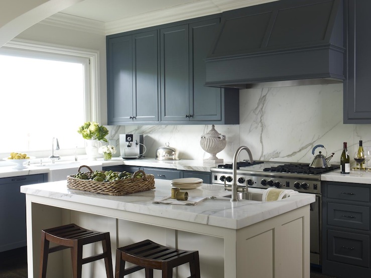
The wet bar is also a great place to add some art (via Terra Cotta Design).
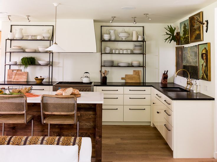
Lauren Liess has been a design icon for me for awhile, and her previous home's kitchen is a great example why. Tip: Flea markets and thrift stores are a great place to get vintage oil paintings.

Over the stove is another great place to bring in a framed piece. (via The Paper Mulberry)

This last one doesn't technically have art, but I love how the leaning wood cutting boards act as a great replacement. It just goes to show, it doesn't have to be fancy to work! (via The Proper Hunt)
Now go add some art to the heart of your home.
*Designer tip: Stay away from themed items like pictures of utensils and coffee cups and word art for a more high-end look.
For more inspiration, follow us on Pinterest, Instagram or subscribe to our posts in the sidebar (or lower bar on your smart phone).