Before and After: A Man Cave in the Making
/When my husband and I moved into our new home, he was so excited to have an extra room to call his own. It wasn't huge, but it was his :) The previous owners used it as a bedroom for their 5-year-old son, who apparently was really into safari animals. Perhaps you are starting to imagine where the "before" in this before and after began.
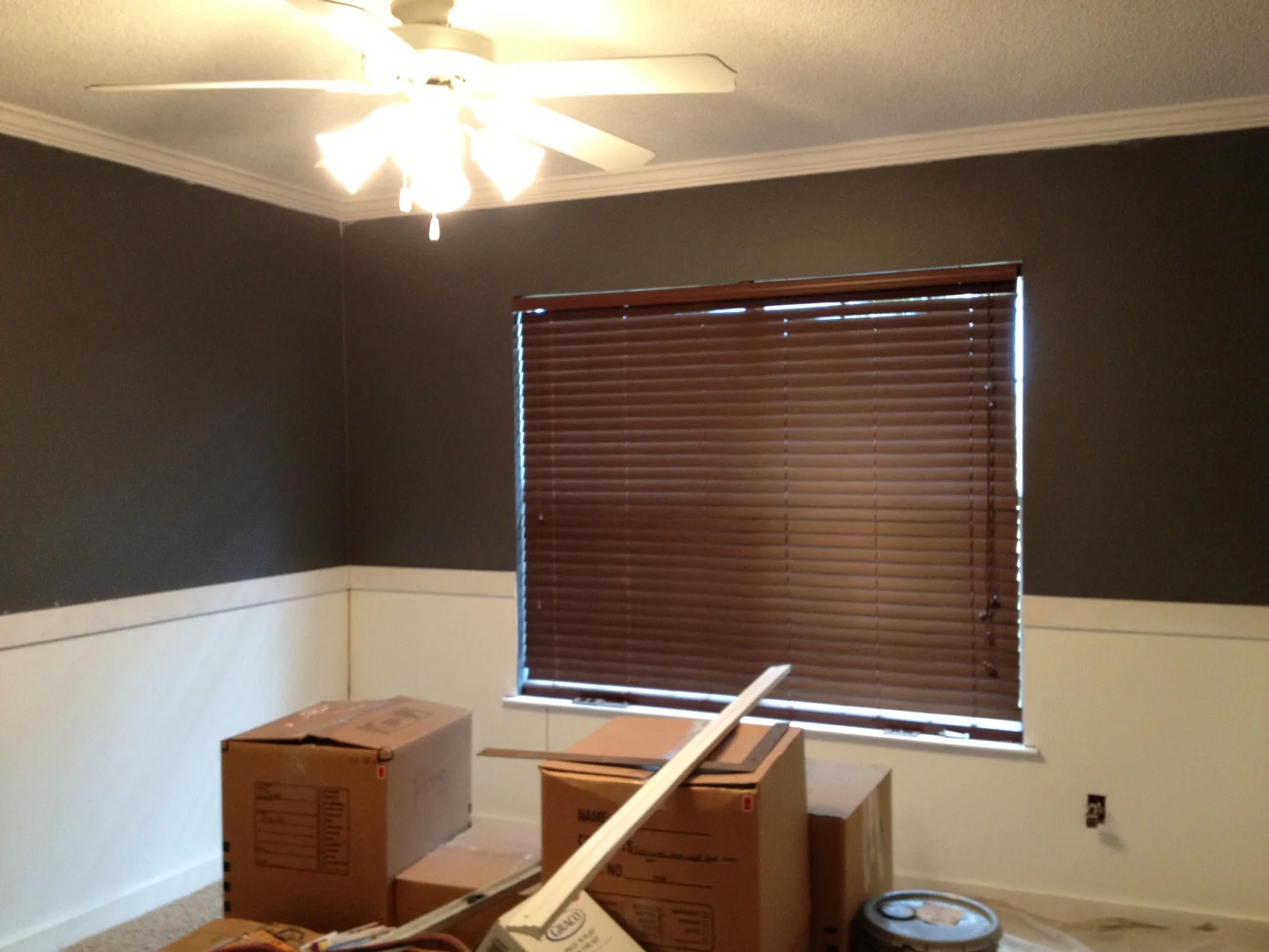
The little boy's room had a safari theme, complete with bamboo fencing on the lower part of the walls and a metallic gold faux finish on the top. The brown chair rail, foot boards and outlet covers were dating this 21st century room/house at least 30 years. It's the little things, people. It really is. So, since the room was not exactly putting the "man" in man cave, I got to work.

After ripping off the bamboo and trim, which unfortunately was put on with a nail gun and liquid nails (aka will damage drywall upon removal), I decided to just cover that part of the walls. I wanted to add a little more interest to the space with some wainscoting and crown molding anyway so it seemed like the perfect solution.
Just changing the paint scheme, standard white on the bottom and Benjamin Moore's Charcoal Slate on top made a HUGE difference. It already felt like an entirely new space. The rest was just finishing off the details and adding the wainscoting stiles.
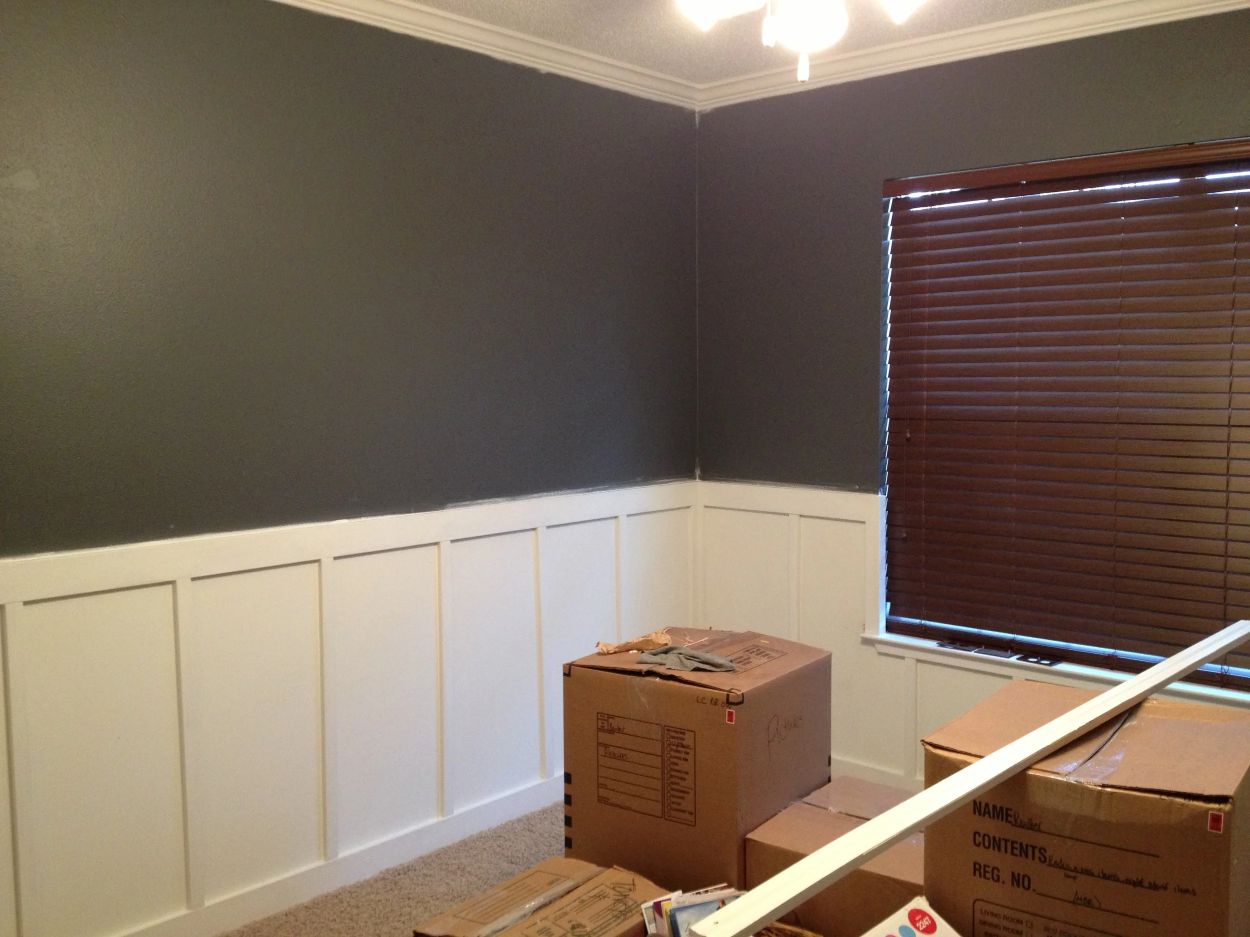
Wall color: Benjamin Moore Charcoal Slate
Pardon the iPhone photography and moving boxes, but you get the idea. Quite a change, huh? Since this photo was taken, the walls were touched up and adorned with a gallery of Jon's military memorabilia. Once we finish up the space and decide on the last furniture pieces, I'll be sure to post another picture. In the meantime, I hope this shows you just how much a little paint and trim can transform a space. I absolutely love it. And whether or not it stays a man cave or turns into another bedroom later on down the road, it'll be great either way. No extra painting/renovations needed=music to my husband's ears.
Unfortunately for him, my mind is still churning and working on several other rooms in our home. A designer's home is never done. :) But I digress... Here's one last side-by-side comparison of the room:
Have a wonderful weekend everyone!