An easy DIY and a sneak peek
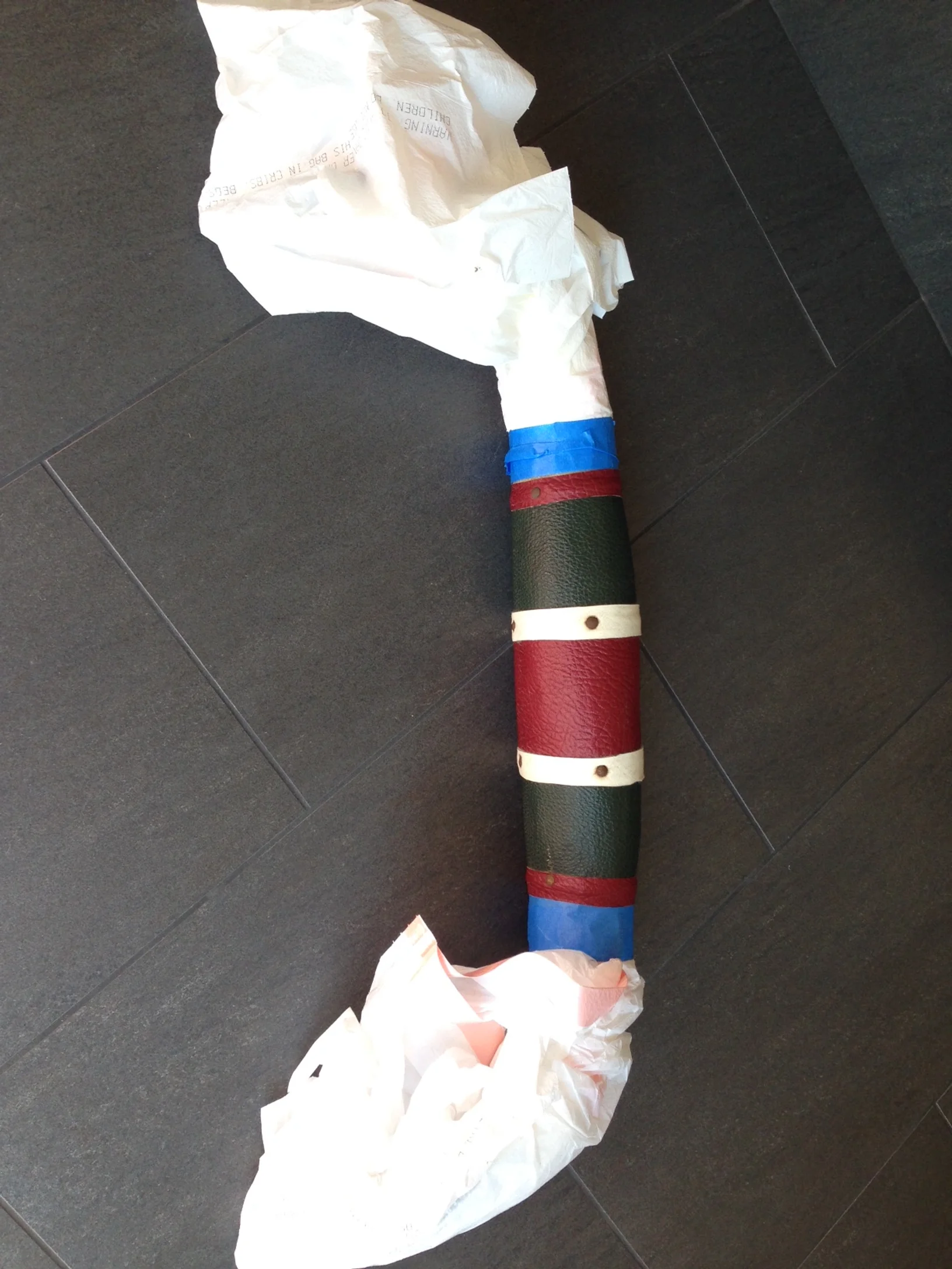
Recently, I had been given a set of bull horns (along with permission to redo the setting how I deemed fit) from Ty’s sweet uncle.

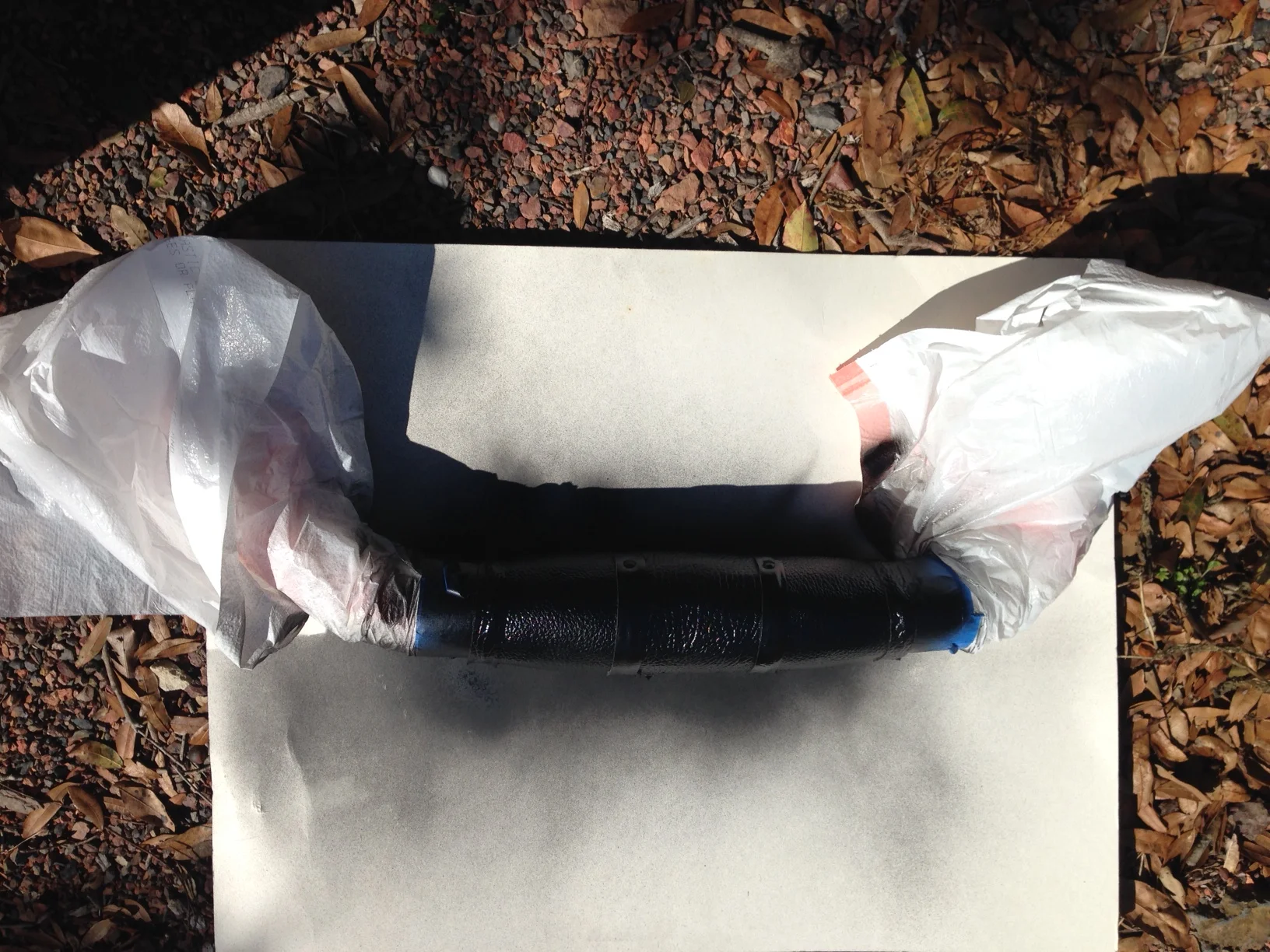
The horns were covered originally in red, green and white leather, which really did not match the colors in my house. So, I decided to attempt to re-wrap the setting myself and ordered a piece of black leather online. Unfortunately, the leather ended up being to thick to use, so as a last resort I gave spray-painting a try.

Now, if this were a piece that would come in contact a lot, I would recommend purchasing upholstery spray paint which can be purchased at an auto body shop. But since it was going to be hung on the wall, I used regular old spray paint.

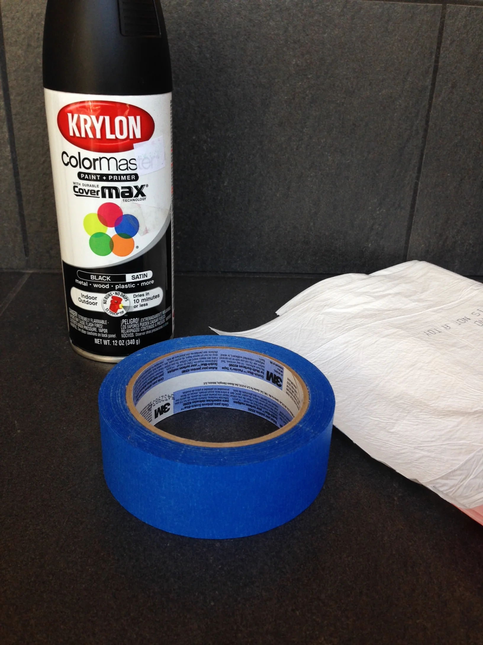
I wrapped the horns with garbage bags and secured them with painters tape. Some websites suggest wiping the leather down with alcohol before painting but I did not bother.

spray painting leather mounted horns

Then took them outside and sprayed an even coat to one side. Let it dried for 20 minutes than flipped it over and sprayed the other side. The spray paint took pretty well. After curing for a couple days, up they went on the sunroom wall.

Ta-daa!

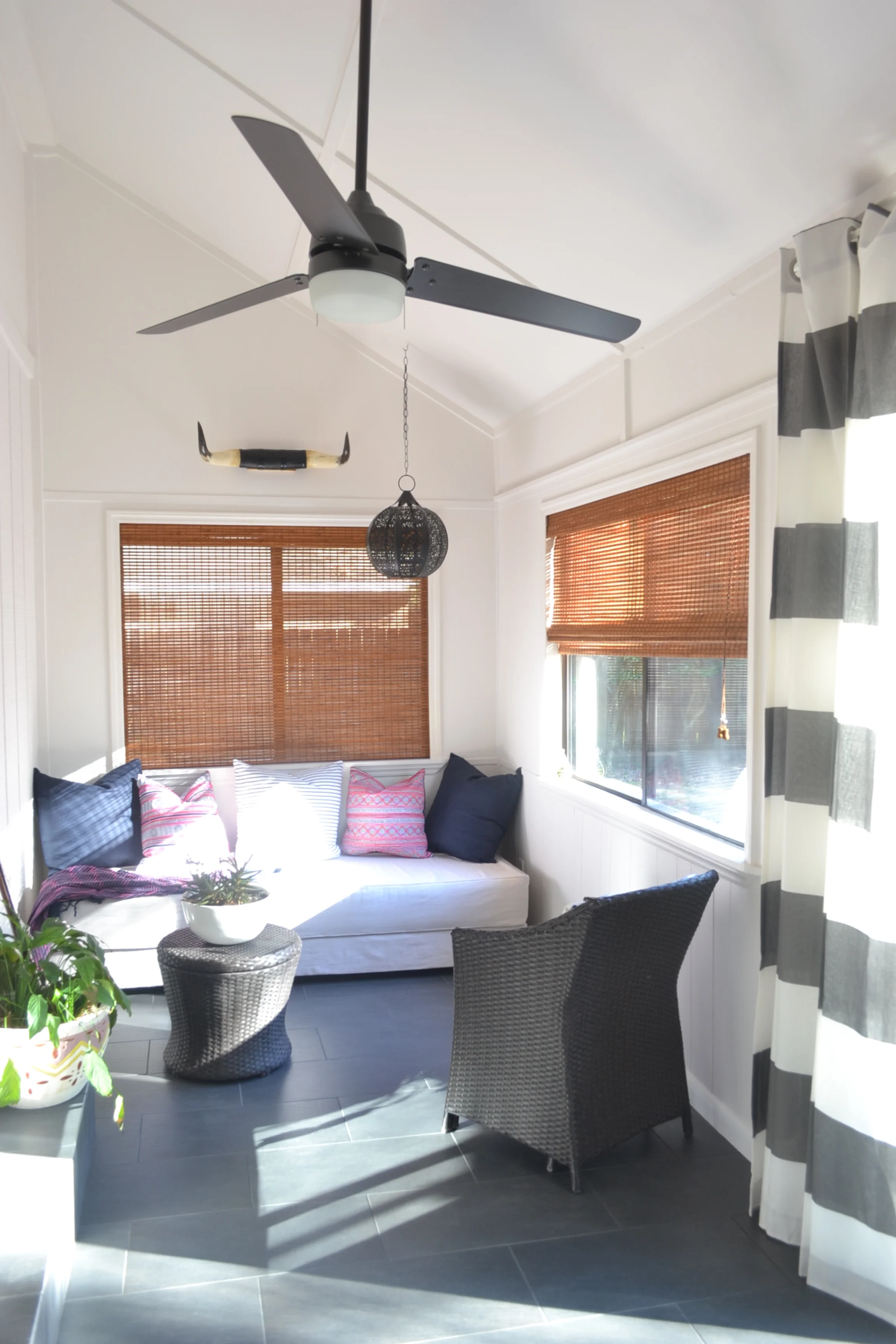
With booked up contractors, strikes holding up deliveries, and being so busy, the sunroom has taken much longer to complete than I had anticipated but we are getting close. If you recall in my original sunroom post, I was debating on the flooring. In the end, we went with a 12x24 porcelain tile in Nero and am pretty pleased with how it turned out. I also, ended up going with a more contemporary fan than the more tropical one I had planned on. The sleeker lines ultimately matched better with the rest of the house.

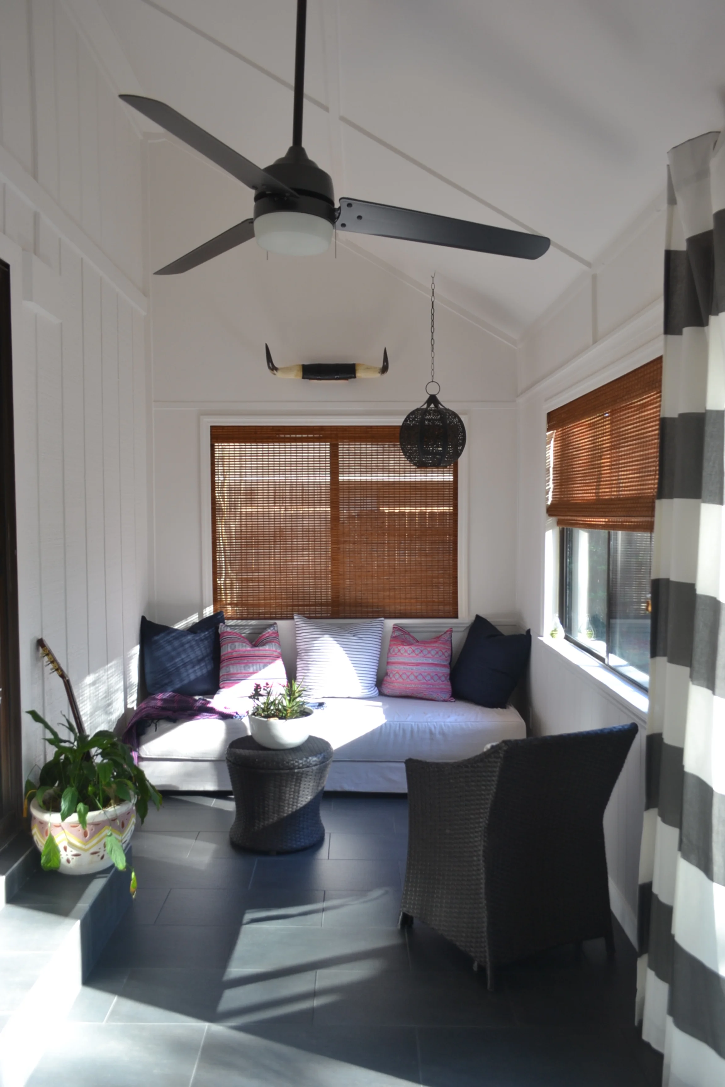
The remaining items I need are a larger table and something to go on the blank wall. I have also debated about keeping this chair and reupholstering it or replacing it entirely with the Storsele chair from Ikea. Once I am finish I promise to share more pics of the space.

DSC_1133 copy.jpg
ikea storsele chair

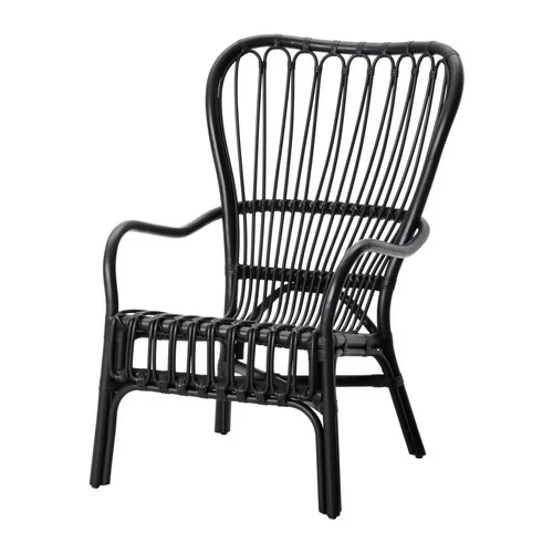
What do you think? Reupholster the existing chair ore replace it with the Storsele?

Home Tour: Making the Most of Small Spaces

As our family grows, my husband and I are constantly thinking and re-thinking what the perfect family home would look like for us (this comes naturally to an architect and designer--you should see us at restaurants--no napkin is left without a doodle, and my purse almost always carries a sketchbook if my husband is with me). 

Against our instincts (and probably the instincts of many), it's the small spaces that intrigue us the most. I've featured tiny homes in a post before, and although I don't think that would work for us in our current situation, it's not something we've ruled out for the more distant future. 

Small space living is not something we're accustomed to here. I mean let's face it. Big houses are a status symbol. It's not our natural tendency to "dream of smaller spaces." No one ever said "I wish I had less storage." You get the idea.

So when we see someone pull it off--especially a family of four, like the home of interior designer Jessica Helgerson featured in the Houzz tour below, we take serious note. You may not relate to us. AT ALL. And that's totally understandable. But you have to admit as you scroll through the planning of this house--it's totally genius. The use of space is excellent. You can tell it's small, but none of it feels tight or crowded. Hats off to Jessica!

My favorite room (as I've seen and pinned on Pinterest) is the bunk room. A lot of parents of multiples argue that shared rooms don't work forever because children eventually need privacy. And while these kids aren't exactly teenagers yet, the bunk is designed (as many clever bunks are these days) with a cubby-like feel, so each bunk user is walled-in on three sides. It definitely lends itself to much more than just snoozing.

So take a look for yourself. Even if the small space isn't appealing, you have to admit the design is very well executed. Not a space left un-used.  

What are your thoughts? Could you see yourself living here (with some adjustment, I'm sure)? 

Maybe just as a vacation home? ;) I hope it's at least inspired you to think outside of the ordinary home design!

Until next time!

One Artist, Six Nurseries: Mallory's Design

If you've been following us this week, you've seen that we're doing a nursery challenge, where we each design a boy and girl nursery around artwork by the talented, Gingiber.  If you haven't checked out all of the adorable pieces she has to offer, you should!  

Dana detailed her nurseries designs on Monday and Jessica showed her's in the last post.  None of us knew what the other was going to do or use in the room so we've really enjoyed seeing how our different design aesthetics how shown themselves in the spaces.  Now it's my turn for the big reveal.

I love a good, classic design and the same is true in my boy's nursery.  I kept the palette soothing and fun with a play on texture and pattern, and I love the end result.  With darker walls in Benjamin Moore's Winter Solstice and solid ivory (with blackout lining!) curtains, the rest of the fabrics and finishes can take center stage.  And let's not forget to mention the Persidio Glider by Serena and Lily.  It has a removable slipcover--a treasure in the land of baby messes.

Crib // Crib Sheet // Bookcase // Light // Rug // Glider // Pillow Cover // Pouf // Curtains // Dresser // Paint

For my girl nursery, I kept another neutral palette with pops coral and tones of blue and cream for a feminine feel.  I used the Land of Nod Hampshire Dresser in both spaces because it is such a versatile piece that can grow with the child.  The ottoman pouf and curtains (although in a different shade) are also carried over from the boy nursery design.  Again, these are pieces that can work in many spaces (even if you choose to move them to another area in your home later).  I chose another slipcovered glider from Serena and Lily for this space and outfitted it in a coral jaipur print.  It is a bit of a splurge, but the quality and slipcover option will allow for many years of use.

  Crib // Crib Sheet // Bed Skirt // Bookcase // Light // Rug // Glider // Pillow Cover // Pouf // Curtains // Dresser // Paint

The bookcase and beautiful iron crib with upholstered sides are from Pottery Barn Kids.  Here's another shot of the crib (in an alternate finish) to give you a better view of the sides.  I love the mix of the soft upholstery with the iron details.

The light fixture is the finishing jewel in this space.  I've said time and again that light fixtures can truly transform a space and this one is the perfect choice.  The shape is eye-catching and when the bulbs are lit, they will cast a playful shadows around the room.  I have a similar cutout style in my daughter's nursery, and I still love it.

Alright, so that's it!  That's a wrap for our Nursery Challenge week.  We hope you've enjoyed seeing our varying designs as much as we have enjoyed making them.  If you need help with a nursery (or any other room) in your home, please let us know.  

Thanks for coming along for the ride this week!  We'd love to hear which designs and pieces really caught your eye.  Comment on each post or let us know on Facebook.

One Artist, Six Nurseries: Jessica's Design

If you are just following us, we are doing a design challenge where each one of the 3A designers have to create a nursery around the same artwork. It has been fun seeing how each of us are differently inspired by the featured Gingiber artwork.

When starting my designs, the first pieces I selected were the cribs, since they tend to be the main focus of a nursery. My go to vendor for great children's furniture is Land of Nod. They have a beautiful selection of cribs ranging in different styles. As a neutral backdrop, the paint color for both designs is Benjamin Moore's Silver Satin. 

For my boy's nursery, I was going for a cabin look which I think the light fixture and rocker lends itself to. The book shelf is another Land of Nod find and is great for holding both books and toys. My heart was set on a navy buffalo check crib skirt but since I could not find one, I found fabric that could be used to make a custom one.

timeless boy nursery design

bookshelf // crib // crib skirt fabric // crib sheet // curtains // rug  // rocker // dresser // light fixture // art

For my girl's nursery I decided to go with a muted feminine look. I love the shape of this Jenny Lind crib and paired it with a  light fixture that picks up on the circular shapes. I kept the furniture neutral and brought in pink through the accessories. To create more interest, we always recommend to not purchase a complete bedding set. In this design, the crib sheet is from an Etsy vendor and the skirt is from Land of Nod. I love how it turned it out! If you are interested in any of the items, the links are below.

timeless girl nursery design

One Artist, Six Nurseries: Dana's Design

Over at 3A, we’ve all found ourselves in the “young children” phase of life, all of us having kids (me with our second on the way). And for this reason, many of our friends and clients are in similar stages of life, making nurseries a big part of our design minds. 

We love working on nurseries for many reasons—partly because bringing together a nursery is more than just creating a new space; it’s setting the stage for a new addition to a family. There’s so much excitement involved! And luckily for us, nurseries all start with the same basic foundation, meaning they all require the same basics: crib, changing table, rocker…you get the idea. The true design aspect comes from blending the client’s personalities with the gender (if known) and our design eye. We love seeing the reaction from expectant parents when they know we’ve created something for their home that’s so much more than they ever could have purchased as part of a package at a department store. Nurseries are so personal—which is another reason why we love them! 

One part of personalizing a nursery is selecting fun artwork for a space. Babies are so visual, so we love bringing in simple, bright, and whimsical pieces. When we discovered Gingiber art prints, we were instantly inspired by her fun animal prints to put in a nursery. Here’s where the cool part comes in: we three all work well together for a cohesive design look. But we all bring individual aspects to the table. So we thought it would be fun for you to see what each of us envisioned, all while being inspired by the same artist. This week we will each present a feminine and masculine nursery to share with you.

The idea is to start with a generally neutral palette and add on masculine or feminine elements as needed. None of us have ever been fans of overly “boy” or “girl” nurseries, and we’d probably argue that as a good rule of thumb for any space. We find it makes an overall more appealing space, more peaceful, and it’s very easy to reuse the elements again for a new baby, or for your growing child.

I decided to keep mine clean and simple: modern pieces accented with a little whimsy in the textiles. I love a fun patterned crib sheet, since it’s mainly what babies will see. And I can’t resist pom-pom trim on anything. 

Anyway, onto my designs:

modern boy nursery moodboard
modern girl nursery moodboard

crib // crib skirt // crib sheet // light fixture // bookcase and storage baskets // rocker // ottoman // sheepskin // flooring // dresser // curtains // paint 

A few notes about the designs:

  1. The curtains are black-outs, which I have now decided are very important in a child’s room. The client I worked for with my very first nursery design insisted on black-outs, and I couldn’t understand why. I always heard (and experienced) that babies were immune to times of day when it came to sleep. That may be true, but what’s also true (as I learned) is that babies turn into toddlers. Toddlers that wake with full energy at the first hint of daylight. So it’s best to delay daylight creeping in for as long as possible!
  2. The rockers are originally known as Eames Shell Rockers. They are one of my all-time favorite chairs (I have a lot of all-time favorite chairs, in case you’re wondering why I say that a lot). The “real” reproduction, or even a vintage original, will cost a lot. But fear not, as there are people out there that make nearly identical knock-offs for a fraction of the cost. I chose to source the original for the boy nursery because of the aqua color. However, there is a knock-off in light blue that you can find here. (In the girl nursery, I went straight for the knock-off in that easily-found orange.)
  3. The flooring I’ve chosen is not a rug, but carpet tiles. These convenient squares not only make it easy to choose a size that’s perfect for your space, but they also make it super easy to remedy any spills or stains that may prove hard to get out. Simply remove and discard the soiled square and replace it with a spare. For this reason, it’s always best to order a few more than what you originally need! 

I never imagined I’d pick pink for a nursery, but I actually like it here for my girl nursery, with the soft, barely pink walls and in the natural linen crib skirt. And it’s always good push your own envelope! Who knows when we may have a client who wants all pink.

I love that there’s still plenty of room for personalization here—in more artwork, toys and shelf knick-knacks, and other personalized items for your baby. It’s always fun to spell out your baby’s name or use his or her initial somehow if you’ve chosen one. Maybe you can use one of these designs for a starting point in your own nursery! 

Or if you’ve started a nursery design and (as it tends to happen) have gotten more and more pregnant and now just want it finished, contact us here for an easy solution to nursery design. We would love to help!

Until next time!

Get the Look: Estee Stanley Girl's Bedroom

I've long been a fan of celebrity interior designer Estee Stanley's work and this darling little girl's room is no exception.  When I saw it in Lonny several years ago, I instantly fell in love.  The subtle pinks mixed with warm ivories and dark woods make for a sweet and sophisticated space while all of the layers of texture and pattern give it a childish bohemian vibe any little girl would be lucky to call her own. 

The dark wood ceiling and beams might be hard to replicate in your home, but I've put together a few other items to give you the overall look of this beautiful space... just in case you love it as much as I do.

estee stanley girl room via lonny
sophisticated bohemian girls room 3a design studio