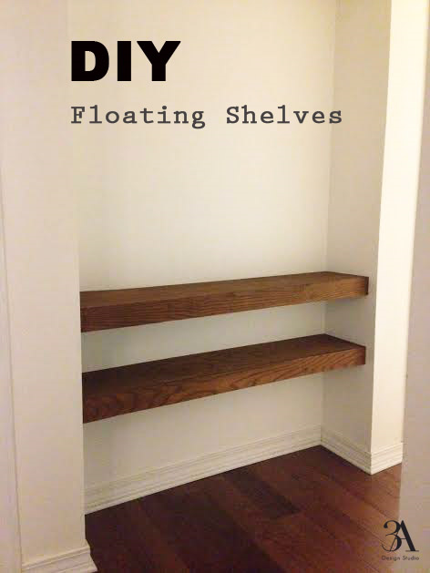
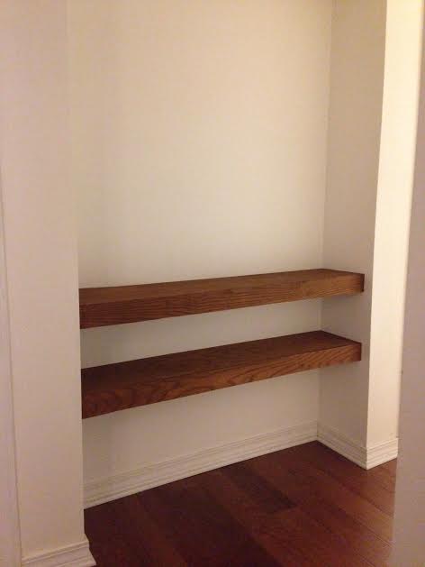
DIY Floating Shelves

diy floating shelves

After writing my post on mudrooms and sharing my frustration with the lack of organizational space we have, Mr. Nguyen told me to pick a weekend and we would knock out the hall project that I have been wanting to complete for over a year. Not only was I surprised that hubby reads my blog posts, I was thrilled to finally get the project done!

Meet our subject. This is the hall leading to our garage. When we moved in, it had been a narrow linen closet with even narrower floor to ceiling shelving and ugly bi-fold doors. The shelves were too narrow to fit much of anything on, so about a year ago we had the shelving removed and the walls patched up. It remained that way until this past weekend.

hall before

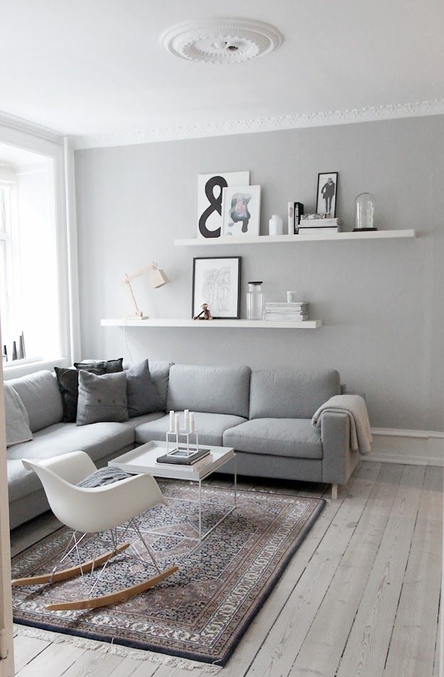
Since the alcove is too narrow for a bench, the plan was to build a couple floating shelves to act as a an area to display some art and also house keys and such.

After, it was decided to make the shelves approximately 10" deep x  3" high, the following items were purchased:  

 (2) 1x3x8 -one for each shelf                                                                                                                                                                        (1) cabinet grade sheet of 1/4" 4x8- for the top, bottom and front piece for both shelves                                                                 (1) pack of 1/4 toggle bolts
(1) can of Rustoleum stain in "Wheat"                                                                                                                                                        (1) Minwax stainable wood filler (Go with the larger size. I bought the smaller container and ended up needing more.)

rustoleum wheat wood stain
minwax stainable wood filler

To make it easier to transport, we had Lowe's cut down the 4x8 sheet into 4 top and bottom panels and 2 fronts which made the installation go quicker. The first step was to create a skeleton for each shelf using the 1x3x8. *Keep in mind when cutting the outward extending pieces to deduct both the depth of the back brace and front panel from your overall length so that you achieve the correct fished shelf depth. Also note, a 1x3 is not really 3" but actually 2.5". 

DSC_0992.JPG

The skeleton was then bolted to the wall and then the front, bottom, and top panels were nailed on.

I did not bother conditioning the wood before applying the stain. Once, the stain had dried it was a bit too yellow for me. The store had already closed and since I was on a roll, I decided to give Dana's coffee stain technique a try. One thing to note, use caution when brushing the coffee near the walls. Since it is very thin, it got underneath the painter's tape in some areas which I had to then go back and paint over.

It may be hard to tell from the pic, but after three quick coats of coffee the shelves had achieved a warmer tone that I liked. I definitely recommend using coffee as a stain. Not only is it cheap but smells good, as opposed to the toxic fumes that traditional stains have.

Well, there you have it. Now comes the fun part of decorating. If money were no issue I would purchase one of Jai Vasicek Malachi paintings and it would look something like this.

And on the adjoining wall a row of matte black hooks like this one.

matte black wall hooks

 Vasicek has a waiting list for his paintings, if that gives you any indication of the likely hood I would be able to procure one. So, I am thinking about painting an interpretation of his Malachi series. Eek! I will keep you posted if I get the nerve to do it.

Have a good one!


Moodboard: A Modern Kids' Creative Space

Not so long ago, I stumbled upon a photo of a great kids' space on Pinterest. My husband and I ooh-ed and ahh-ed over it, and then I swear one of us pinned it, and now it is lost forever. I swear I spent an hour looking for it only to turn up with nothing. Nothing even remotely close to how great that space worked. And it was a great lead-up as the inspiration for this post.

So you'll just have to take my word for it. 

Anyway, in my last post, I talked about how we were slowly transforming our would-be dining room into a kid space. It's very important that this is not misunderstood to be a catch-all space for toys. The baby/toddler stage is short-lived compared to the lifespan of a home, or however long your family lives in it. It's important to us that any space belonging to our kids is constructive towards learning and creating. (Or on the other hand, sleeping. As many sleeping spaces as they want!! So long as, you know, they actually sleep.)

So I put together one example of what that might look like for us: 

modern kids' creative space moodboard

I like a clean, minimalist approach to a kids' space. Because this may look simple, but anyone with kid experience knows that in real life there would be crayons and paper all over the table, books and knick-knacks on the shelf, doodles and scribbles and backwards lowercase "a's" on the chalkboard wall, and most likely other odd things scattered on the floor. Best to keep the design scheme on the opposite end of busy ;) 

Also, as much as I love adding a few vintage, restored and repurposed pieces in just about every room, kids just don't appreciate that. They like new, bright, shiny. Once your kid is running and talking, they can think on their own. They have opinions. They like the pink sparkle keds, no matter how much you want them to like the red chucks. They'd much rather wear the dinosaur shirt than the monogrammed one. They're kids. What can ya do?

Here's the Sourcing:

Vertical Bookshelf and Storage Cubes - Probably the most widely used storage piece for kid stuff. It's so versatile. Ikea would be a fool to get rid of it. 

Storage Console

Light Fixture

Pom-Pom Garland - No particular source for this. First because it's easy to make yourself, and secondly because every crafty person on Etsy makes them.

Corkboard - Again, no source because you can get it almost anywhere and cut it down to whatever size you need

Round Table Lamp - I thought this was a great inexpensive (but still modern-looking) option because I can see a book go flying and not hear the sounds of lamp crashes quickly following. And it gives a soft glow--probably enough to read a book nearby without overhead lights 

Storage Basket

Bean Bag Chairs - Not the most inexpensive option, but functional, stylish, and they have a removable cover! Winner! 

Wood Table and Chairs - I'm not even sourcing these because it would depress all of us. This is the Eames plywood table and chairs, or as they're more popularly called--the "potato chip chair." I love them. They love me. And they come in kid sizes, making them even more irresistible. Should you ever find these in a thrift store or on Craig's List, it is part of your civic duty to call me immediately. Now that we've covered that, Ikea makes a perfectly good table and chair set for kids that's made of unstained, unfinished pine. We have it. It's unbeatable for the money.

Rug - Indoor/Outdoor. Essential for kids because that equals "hard to ruin."

Supply Cart - I've seen this cute cart used so many ways. It's adorable and functional. Win-win.

Chalkboard Paint - Pretty much anywhere these days. We used Valspar and so far no complaints.

Spot Lights

Paint - A very pale turquoise to give the room a little fun. Also blue is calming. (If you want to incur temper tantrums, go ahead and paint your little girl's room that nice pepto pink. Color psychology is real, people.)

I used a lot of Ikea products in this room for several reasons. Most obviously, it's inexpensive. Ikea makes great products for grown-ups, but I think they take the gold on their children's products. If you don't have kids you'd never know because you probably whiz straight past this section and onto the swedish meatballs and $5 photo frames. But I'm telling you--it's great. We discovered it on our last trip and couldn't break away. They don't just sell "toys", you know? All of their products are well-thought out and have some learning built into them. You can also find great wood and metal play-thing options (making the environmentally conscious parent's feat of avoiding plastic more possible), and for the length of time your kid actually uses the things you purchase, they really stand the test of time. $20 for a wood table and 2 chairs?? SOLD. 

There are a few more expensive items in this room, but keep in mind, this is an inspiration mood board. If you keep your eyes open, you can find some great deals on similar items that may work just as well. Or you may find the price justifiable for your wallet based on the use it will get in your home. All-in-all, it's a feasible space that will get plenty of use from ages 2 on up. The pieces are intended to stick around and change in use with your kids' needs.

Does your playroom need a functional overhaul with the help of a trained design eye? Try E-Design. We would love to help you! 

Until next time!

Client Design: A Modern Classic Kitchen

We recently had a client contact us about helping them update their kitchen.  The couple didn't want to do a huge renovation or overhaul, just some ideas they could easily implement to give their kitchen a facelift.  Lucky for them, our E-Design process was perfect for such a task!

Lucky for us, they already had great bones to work with--an island, shaker style cabinets, a built-in banquette. They had also recently purchased these modern barstools and they wanted to know how to incorporate them into a more traditional style like the rest of their home.

We loved the clean lines of the stools and were excited to get to work marrying traditional pieces with some modern touches.  Here is what we designed.

The lights over the island are a much cheaper version to Troy Lighting's Maidstone.  It was a great fit for a beautiful style on a budget and wasn't too ornate for some modern pairings.  We suggested updating painting their cherry cabinets in Silvermist (SW-7621) and adding this brass hardware for more clean, modern lines.  A good rule of thumb for hardware is pulls on the drawers and knobs on the doors.

schoolhouse electric brass hardware

For the countertop we suggested this beautiful Torquay Quartz by Cambria.  This was the biggest item in the budget, but it will last forever.  It has the look of marble but with much less maintenance.  They didn't have a backsplash before but were interested in adding one if they could find something in their budget--enter white subway tile.  It's a timeless classic (that's why you see it everywhere), but it's also very affordable. 

For the banquette area we wanted to add in some fun color and pattern with these pillows in a fabric by Kravet.  They add a playfulness to the space and soften the banquette which was previously just a wooden bench.  We topped off the banquette update with this high-gloss, oversized cone pendant light with gold lining inside to add the perfect glow for conversation.

oversized cone shade pendant

We love how this kitchen turned out, and even better, so did the client!  Kitchens are some of the easiest spaces to update with paint, hardware and lighting.  If we can help you spruce up your space, contact us here.


Chalkboard Walls: A Job Well-Done

Screen Shot 2015-01-19 at 8.44.31 AM.png

We recently painted a wall in our house with chalkboard paint. It's a small little wall that includes a doorway, leading from our would-be dining room to our kitchen. Lucky for us (kind of), we have a very spacious breakfast nook which we use for all our meals, and now we've decided to make the dining room a permanent "learning/play space" for children (and the contents of the space tend to overspill into other rooms of the house, but I think that comes with the territory of children--not necessarily the location of the space). 

Anyway, that room is slowly working itself into something visually pleasing (which I'll save for a much later reveal), but for now, let's take a look at some of my favorite inspiration photos and why they work:

image via Pinterest, original source unknown :( Hate it when that happens! Good things need to be sourced!

image via Pinterest, original source unknown :( Hate it when that happens! Good things need to be sourced!

From top to bottom this whole wall has been covered. And to add some visual interest and bring your eye to the unique geometry of the space, they've added a wall clock and some personalized hangings. Love it!

Karson Butler Events' clever workspace via Inspired by This

Karson Butler Events' clever workspace via Inspired by This

Another floor to ceiling chalkboard wall, this black background not only adds some weight to the light and airy workspace, but it doubles as an inspiration board. 

Image from Family Fun Magazine

Image from Family Fun Magazine

Love this! This was one of my main inspirations for our wall. Not only is it an art wall, but it also has an organization function. Everything is neatly placed and ready to become...well...I'm sure not-so-neat ;) 

vintage camera wall photographed by Shawn Hoke, image via Mint Design Blog

vintage camera wall photographed by Shawn Hoke, image via Mint Design Blog

Very clever! This shelving and display wall was given a masculine dark backdrop that helps to catalogue this collector's findings. 

image via Dear Lillie blog

image via Dear Lillie blog

A great use of a framed chalkboard space here. I've seen a lot of framed chalkboards, but they tend to all just be floating in the middle of the wall. Terrible. But here, our friend Dear Lillie made it a nice accessory to her well-styled console table, grounding it nicely and tying it in with the rest of the wall space. Very well done!

Preschool learning corner via The Sweatman Family Blog

Preschool learning corner via The Sweatman Family Blog

Another great framed chalkboard. This one, although not as detailed as the image above, still works well. It's height is directly relative to the shelves on the adjacent wall, and the nice accessories below help it not to have that "floating in space" look. This is also similar to what we're going for in our house.

Image from Isabella and Max Rooms via Lauren Liess

Image from Isabella and Max Rooms via Lauren Liess

I love that this wall is the both the backdrop and the accessory for a gallery wall. The black frames stand out just enough from the deep charcoal walls, and having small frames for your chalk doodles or latest inspirations suggests it's importance to you-- just like the other items in the collage. So smart!

image via Valspar

image via Valspar

Another cool thing about chalkboard paint that might not be evident at first is that it comes in a lot of colors. Several manufacturers carry it, but we got ours in a tinted can of Valspar at Lowes. They had a ton of colors! We are able to come very close to matching our other accent wall which is a dark, warm gray (and the walls are not adjacent so you really can't even tell they're not the same color). 

So, based on the above collection of great examples of chalkboard wall execution, I've put together the following guidelines for painting a chalkboard wall in your home:

1. Choose your wall and color carefully. Are you going to go black? If not, the color should relate to the walls in the rest of your home. Just because it's a chalkboard wall doesn't mean it is exempt from relating to the design scheme. And if you are going black (especially a whole wall), make sure the space can handle it. If you're not going for "moody," make sure you've got a lot of good light.

2. Give it borders. Either paint the wall edge to edge, or consider the balance of your selected area. If you're not going edge-to-edge, give it a frame or border. And make sure it's not floating by it's lonesome by itself. Add surrounding furniture or wall decor. 

3. Give it a purpose. Do you want a chalkboard wall just to doodle on? Consider what you might doodle there. A welcoming logo for visitors, daily motivations, reminders, etc. Are your children using it? Add to it's purpose accordingly. Give it some character just like you would any other wall in your home.

4. Accessorize. This goes with 2 and 3 above. Is it solely a doodle wall? Then perhaps put some artsy prints on the area you won't be doodling on. Or whatever inspires your creativity. Is it for organization? Invest in some good shelving or wall hooks. Add a magnetic board or cork board. Tape off a calendar with washi tape. Get creative!

5. Don't neglect it. Ours has week-old doodles and half-erased scribbles on it right now, and it desperately needs a clean sweep to make room for new ones. Granted, it is a kid space, so a little messiness is understandable, but if your area is frequently seen by guests, fix any smudges, keep it updated, and rotate out your design for something new on a regular basis.


If you've been loving some chalkboard inspirations lately, I would definitely nudge you in the direction of "go for it!" After all, it's just one wall. Even though we painted ours for our daughter, we've all found ourselves using it from time to time. I have a lovely garland drawn around our doorway. And having some attention brought to the wall has inspired us to do other things in the space. I love it.

(Although, word of advice, especially if you use a brand like Valspar--the no VOC rule does not apply to chalkboard paint! I assumed because it was Valspar it was safe to sit my tired pregnant booty on the sofa while my husband painted. A dizzy spell and headache later, I decided to read the paint can and noticed the strong advisory to paint in a well-ventilated area. Oops! Sorry, baby! I left the room and we opened the windows after that...)

Happy creating, friends! 

Until next time...


Designer S.O.S.-Rugs

We recently had a reader message us about a pretty common rug question.  It seemed like a great one to answer in our Designer S.O.S. series so here we are.

Meg from Pensacola wrote...
"I'm trying to find a rug for our living room and most of the ones I see in the stores are 5x7.  Does this mean that's the best option for most spaces?  What are the rules for rug sizes?"

Excellent question, Meg!  And one that is commonly answered incorrectly (in your home).  If there is one design flaw we see the most, it's probably ill-fitting rugs (or artwork hung to high...but we'll discuss that another day).  

The other day I was watching a new favorite TV show of mine and cringed when the big reveal showed a newly renovated living room with a tiny rug in the middle.  It made the whole space feel off.  People, please do not ruin an otherwise beautifully decorated space with a rug that's too small.

Here are a few rules to remember:

1.  Go big or go home.  The bigger, the better is true when it comes to rugs.  Most of us don't have enormous budgets for rugs so to hit the minimum size, measure your seating area and then select the next size up for a rug.  Ex. If your seating area is 6x7, get an 8x10 rug, not a 5x7.  Capish? The rug is the foundation for the design, so you want it to be touching every furniture piece in the design, not floating in the middle of it (see below).

2. Don't float.  As mentioned above, you don't want your rug to look as if it's floating in the room and all of the other furniture is floating around it.  A good rule is to make sure that at least the front legs of the surrounding furniture can sit on top of it.  

For a dining room, make sure all of the legs are on top of it with some room to spare.  You want to be able to have the chairs pulled out and them still be on the rug.  

If all of the furniture legs can be on the rug (front and back sofa legs, for instance), even better. Obviously in a kitchen, entry or bathroom, it can float (remember we're talking about seating areas only).

3. Spread your wings.   This basically just means that you want to make sure that the rug hangs out a few inches (6"-10" is optimal) on each side of the furniture piece.  If your rug width is the same as your furniture, it will look as if its holding on to the edge for dear life.  We don't want that.  

via Domaine Home

via Domaine Home

As Meg mentioned, most retailers only carry 5x7s in stores, but don't be fooled.  Look online for the right size for your room.  If you can't afford as large of a size as you need, you can place one on top of another.  Ex. Put a smaller 5x7 wool rug on top of a less expensive 8x10 jute or sisal.  You can create great texture and layering this way as well--as shown here in cupcakeMag.

Thanks for the question, Meg!  I hope this helps with you pick out your perfect rug size.  

If you have a design question, drop us a line or message us on Facebook. We'd love to help!   Maybe you can be featured in our next Designer S.O.S.


Design Trend :: Indigo Hmong Textiles

Indigo batik textiles seem to be showing up in many design publications these days. Of the indigo batiks, the vintage Hmongs are my favorite.

The Hmong are an Asian ethnic group living in the mountainous regions of Thailand, Vietnam, Laos and China. The beautiful Hmong textiles known as Paj ntaub or "flower cloth" are created using a traditional wax-resist method known as batik. Wax is applied in intricate patterns to a piece of cloth, typically made of hemp or cotton. The cloth is then soaked in natural indigo dyes. The wax acts as a resistant by preventing the dye from soaking through the cloth. After the fabric has been dyed and the wax removed, the beautiful design is revealed. Colorful embroidery is sometimes then added to the fabric.

The Paj ntaub traditionally were applied to skirts worn for funerals, courtship during New Year festivals, as well as baby-carriers, and men's collars.

Image Via Dellshop

Image Via Dellshop

Image source unknown

Image source unknown

Image Via TribalCollection
Image Via Amber Lewis

Image Via Amber Lewis

Image Via Amber Lewis

Image Via Amber Lewis

Image Via Honestly WTF

Image Via Honestly WTF

Image Via Design Love Fest

Vintage Hmong fabrics, as well as ready-made pillows and other soft goods, can be found on Etsy and eBay. Several home décor retailers have caught on to the trend and now offer knock off versions.

Serena and Lily's Camile Scroll pillows

Serena and Lily's Camile Scroll pillows

I bought these pillow covers last year for my sunroom. Can't wait to finally get to use them!

So, what do you think of the trend? Love it or leave it?

If you have a space that is in need of improvement, drop us a line so we can discuss how our custom E-Design process can help you.