Designer SOS: Decorating in a Rental
/We’ve actually received this question several times. And several times we’ve promised a blog post. And now I’ve finally gotten around to it! So thank you to those of you who’ve waited so so patiently!
Here’s the question:
"How do I make my space look great when I’m just renting?"
The answer to this is both simple and complicated. The simple answer is, you do it the same way as home-owners. The complications come in when people move frequently (like military families), when there are several decoration limitations, or if your rental is very dated (one time I was watching a movie filmed in the 70s, and I kid you not, the laminate counters were the exact same ones I had in my rental kitchen at the time).
So without getting too nitty gritty in my answers, I’ve come up with a list of the things that can make the most difference in your rental space.
1. Artwork.
Even in owned homes, people overlook this very important personal touch. Whether it’s family photos, original artwork, prints, or just framed reminders of things that are of personal significance to you.
Artwork is a multi-faceted decor essential, for which I don't have the time or energy to get into completely today. So for now, here are a few artwork guidelines to help you in a rental.
Go BIG. If you have a big neutral wall that is really just exuding plain boringness in your rental, select a large piece of artwork to go there.

If the price tag on big artwork scares you away, there are several creative ways to incorporate large-scale art into your home. An old map, a theatre poster, a pretty tapestry. Be creative! You can even make your own!
Blogger A Beautiful Mess has a great DIY on how to make your own large-scale abstract art. {Click on the link to check it out!}
Or you can blow up a large photo and use it as art. Many print shops (both online and in-store) offer canvas prints of your digital photos.
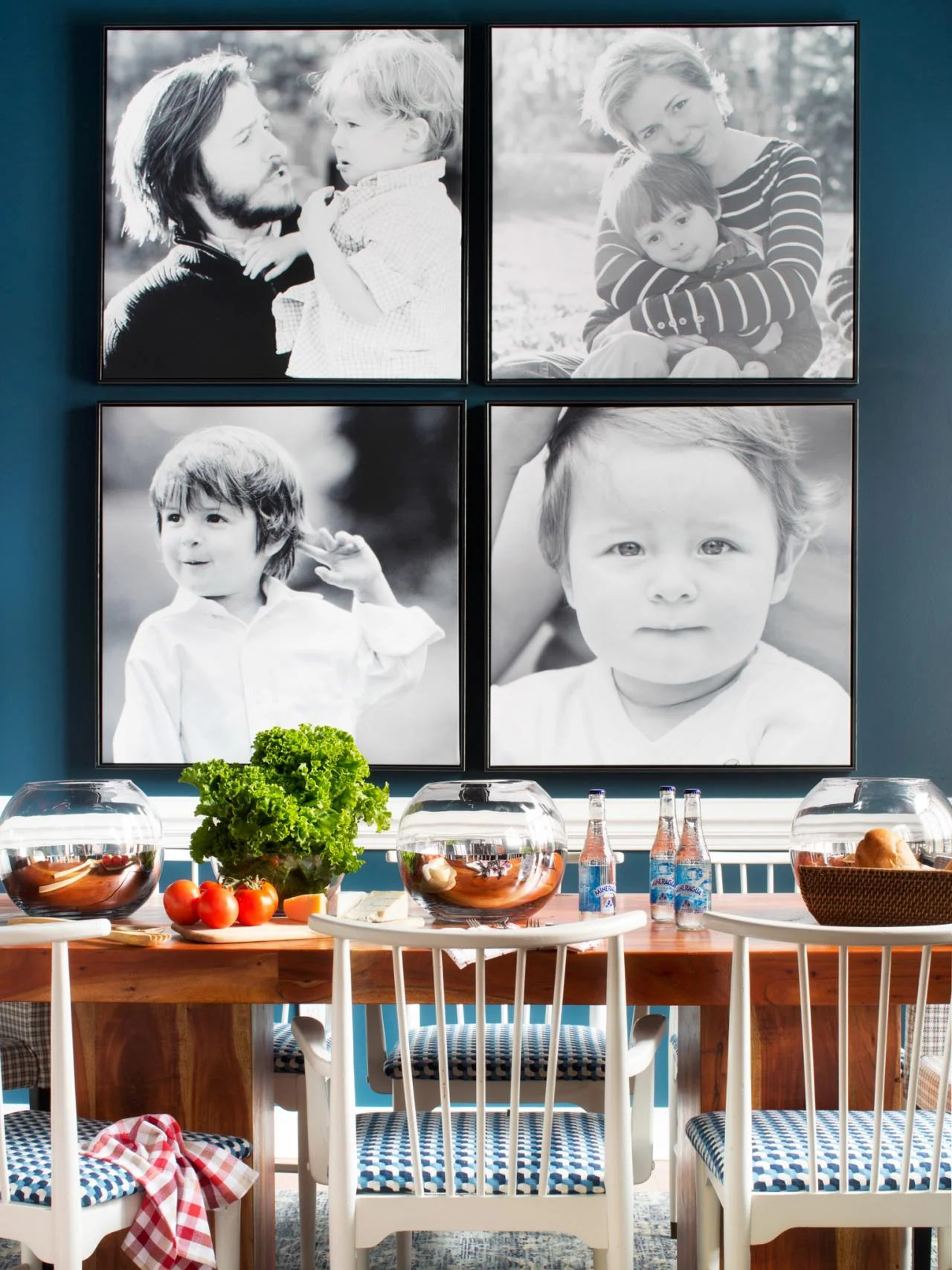
image via HGTV--and a great article to read on unique DIY artwork as well!!
Second artwork tip: Pick neutral frames. This will help downplay those rental beige walls. I know you’re whining right now saying, “ugggghhh, but all my frames are black!” I know, I know. So are most of mine. And I have some on a few walls that I haven’t painted and are still beige. And they look terrible. They stick out like a sore thumb.
Here's an example:
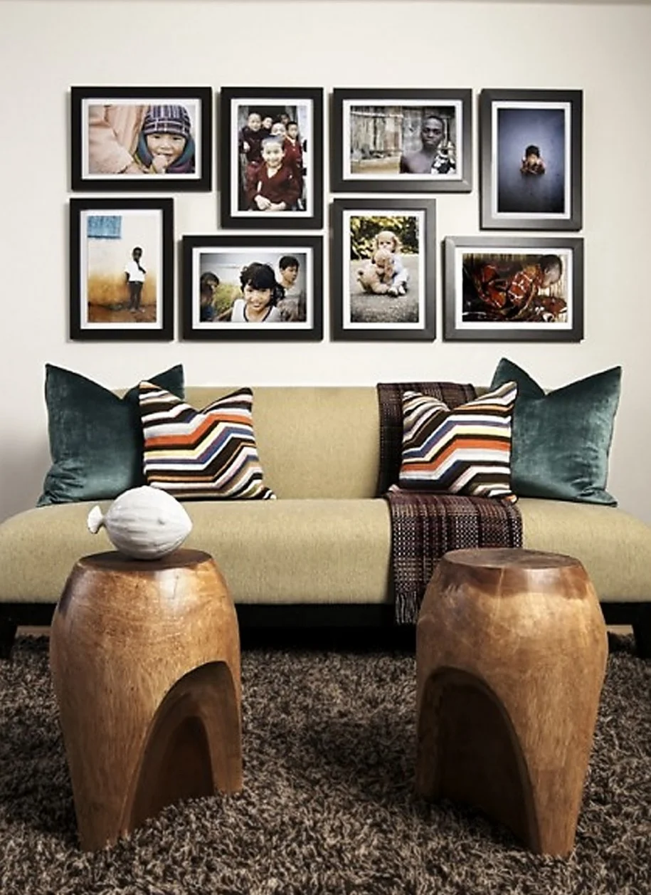
While this is a great photo arrangement, step away from your screen a few feet (come on, just do it). What do you see? If you say "a blob of black" you'd be right. Thick black frames (or even ones in a dark wood finish) tend to distract from the artwork. They also stand out really strongly from neutral walls. If you pick neutral frames and place them on a neutral wall, you'll be able to see the artwork for what it is.
Here's a great example:

image of Amy & Erich Mcvay's home via design sponge
See the difference? You notice the artwork; not the dark frames. My solution to this? Spray paint. Keep your frames. Make them over.
My one exception to this rule would be very thin and uniformly spaced black frames, like blogger Brooklyn Limestone did here in her Shore House. Here, the black frames are understated enough to still allow the artwork to speak.

Onto the next rental tip...
2. Take advantage of rugs.
“But I have carpet,” you say. Doesn’t matter. Rugs not only creative a more cohesive space, but they can add texture, color, and interest to a room. If you have carpet, a flat woven like a dhurrie, kilim, or other natural fiber is going to be your best bet in order to keep your furniture from sinking down on too many layers of plushness (not that any rental carpet I've ever seen has been plush).
Take a look at this room:
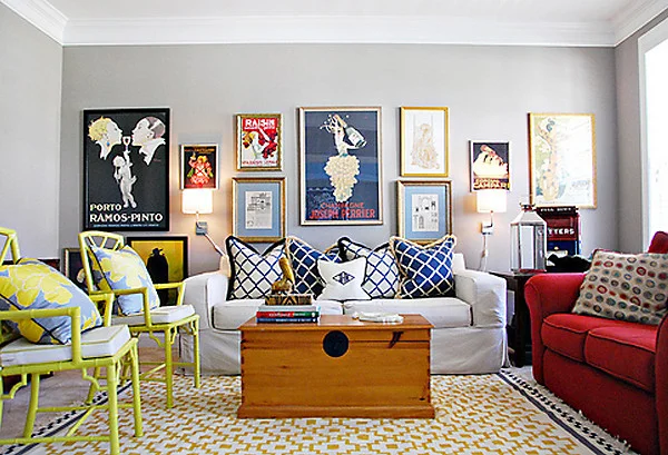
image via Ask Genevieve Gorder on One King's Lane
This room follows the rug guidelines pretty well (which Mallory has written about here). See how much it gives the space? Imagine it without the rug...all the furniture would be just kind of...there. (Also did you notice the neutral frames for the artwork?? And the great large-scale pieces??)
Easy enough, right? Moving on...
3. Change the light fixtures. Find a handy friend or watch a youtube tutorial on how to do this. It’s really quite easy. (But if you electrocute yourself, 3A is not responsible for you forgetting to kill the breaker first.) Even some of the not-so-handy folks I know can change a light fixture. Then just store the old one in a closet until you move, and when you leave you can re-connect the old one again.
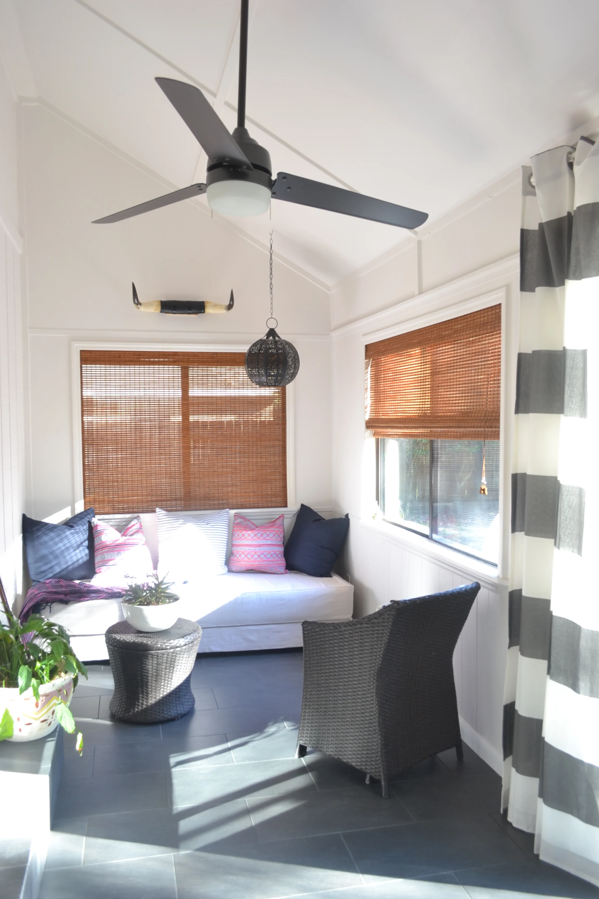
Here’s a photo of my dining space after I changed out the terrible builder-grade fixture:

The process took my husband about 5 minutes (plus another 10 of me saying "lower...no higher...ok another 6 inches higher..."). Of course the other details make a difference, too, but the biggest difference is made by the light fixture.
4. Change the cabinet hardware.
If your hardware is really bad, consider purchasing some simple, inexpensive replacements. The only downside to this is it will most likely be money you don’t get back, unless you plan on changing it all back before you leave and carrying the hardware with you.
{And I apologize, but the internet failed me on this one--I couldn't find any good before and after photos of cabinet hardware that had been changed. There were great ones of repainted cabinets with new hardware, but obviously, as a renter, you probably won't be painting your kitchen cabinets. So when I do this in my kitchen, I'll make sure to take good photos for you!}
I once lived in a tiny old house with periwinkle laminate counters (oddly enough this was not the same rental with the laminate counters I mentioned earlier, with which I had a cinematic encounter). The cabinets were white (thank goodness), but the hardware was old brass that had white paint around the edges from a sloppy paint job. I went to my local hardware store, picked out some simple nickel hardware that was $2 a piece and updated that little kitchen for hardly anything. Considering how few cabinets I had, it was surely less than $25. When I moved out my landlord didn’t even notice (although she did mention how nice the kitchen looked—tricked her!)
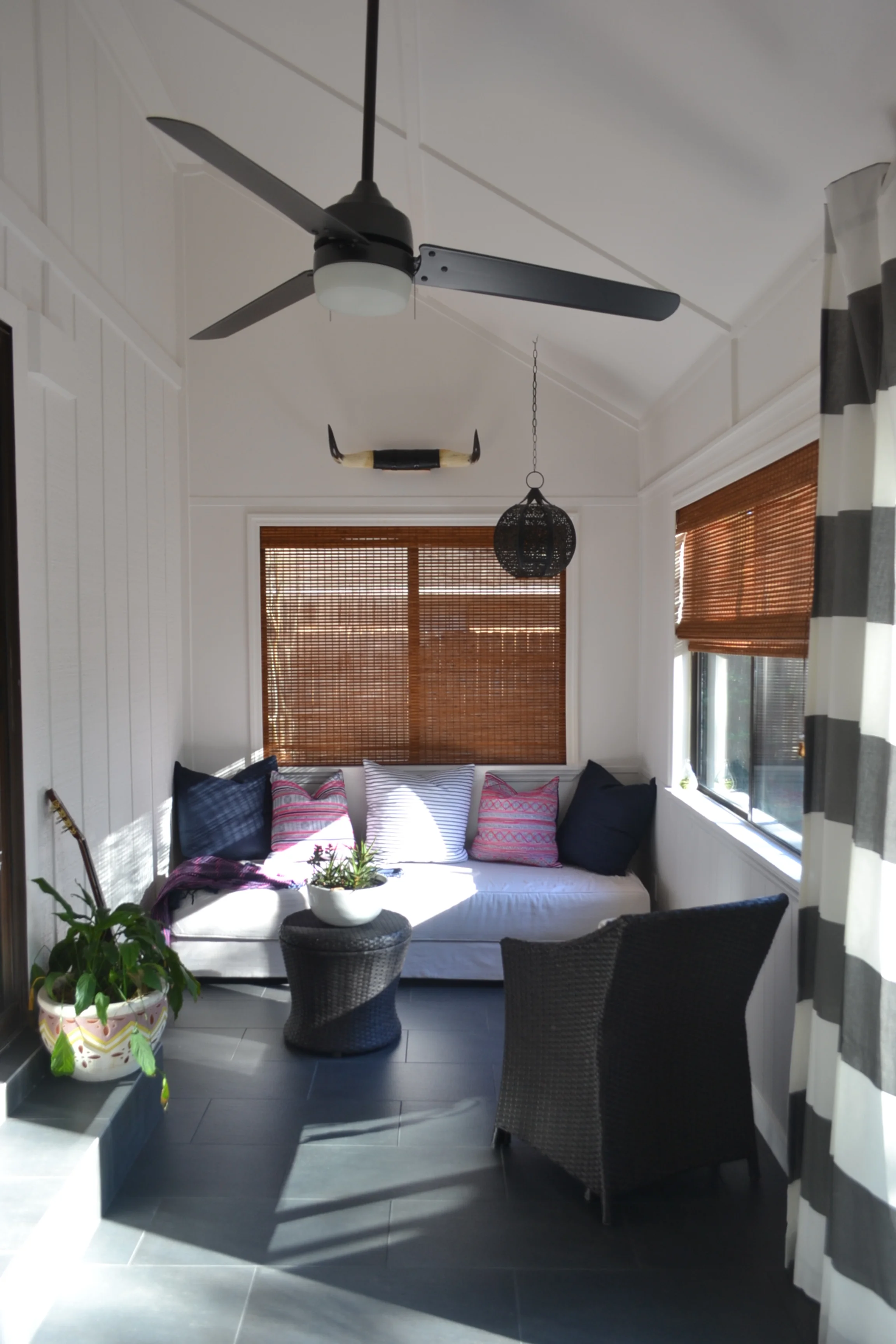
5. Live greenery.
Don’t you be putting some dusty silks on top of your kitchen cabinets. Don’t you do it! There are SO many plants that thrive indoors despite an owner with a black thumb. Need a list? Here's one from Better Homes and Gardens.
Now take a look at this happy space:
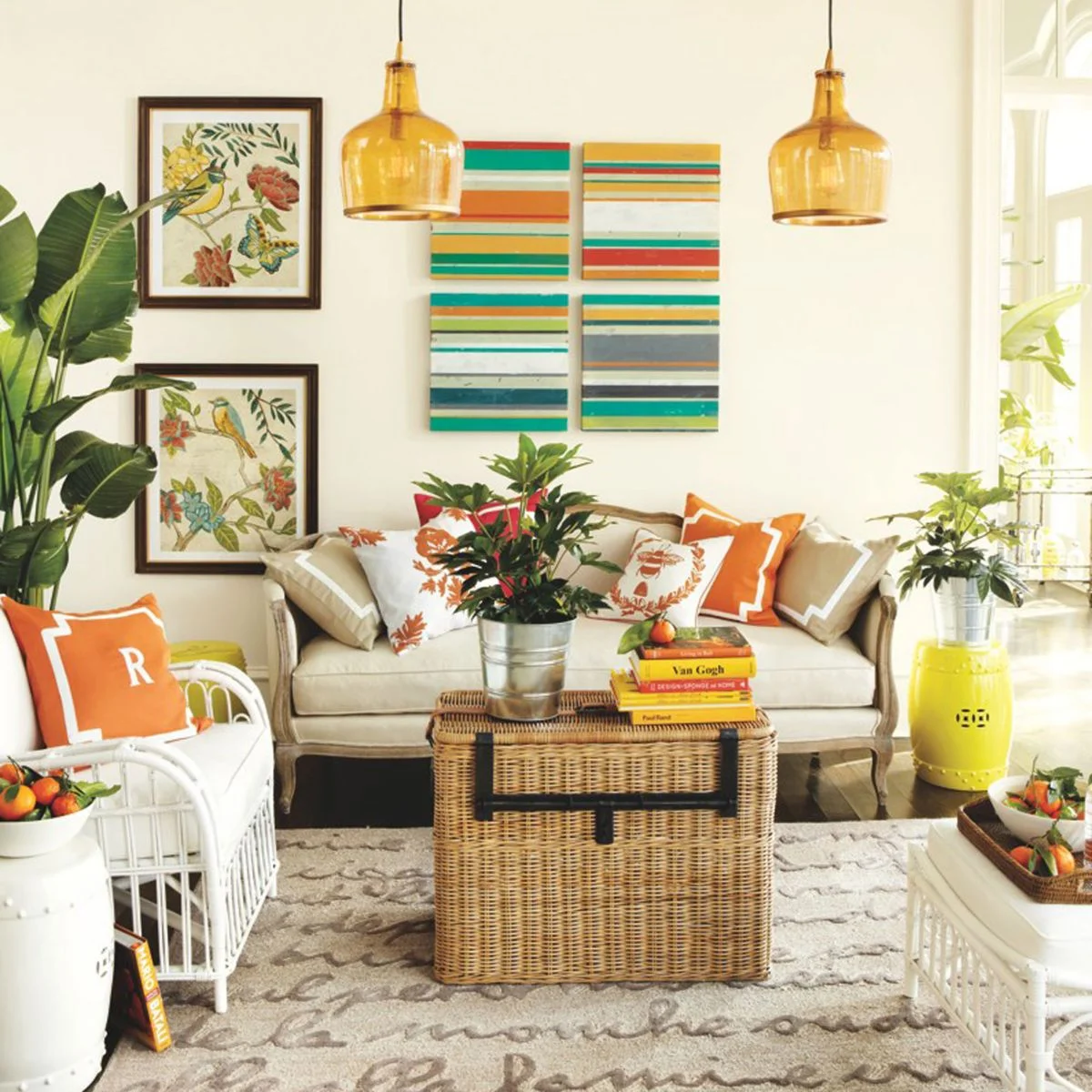
image via pay for buzz
Imagine this space without the plants. It would still be beautiful, but plants give so much to a space. Even more than a decorative advantage, they improve indoor air quality and have even been shown to lower blood pressure in some cases. This is definitely something I wish I’d taken more advantage of as a renter (especially when I lived below a drug dealer—I’m telling you, I’ve lived in some very interesting places).
Any other design tips can be used in rentals the same in any other space. I’ve bragged on her before, but take a look at my friend Lauren’s home featured on The Every Girl . Can you believe it’s a rental?? I'm sure you can find some inspiring design tips in her home.
Even if you’re only staying in a rental for a relatively short time, even a year is long enough to put a little personal touch into your space. Plus, every time you move is an opportunity to start all over with a new design slate. Have fun with it!
Have a specific question related to rental-living? Or need a creative design solution in your temporary space? Drop us a line. We'd love to help!