Backyard Update
/The last couple days here on the Gulf Coast have been so lovely. It is starting to feel like spring and with spring comes sprucing up the yard.
As some of you may recall, our back yard has been an on going project. We have cut down some trees and removed a few structures left by the previous owners, but now we are at point where we need to bring in professionals to re-grade the yard.
After meeting with Executive Landscaping here in Pensacola, we will have a new patio and grass in a just few weeks! Wahoo! Excuse my excitement but for the past few years we have had a backyard full of dirt, weeds, and unpleasant views. It will be so nice to finally get to enjoy our back yard.
The entire project will have to be broken down into two phases.
Phase A is to re-grade the yard, transplant a couple Crype Myrtles, lay a new paver patio, and sod the remaining yard.
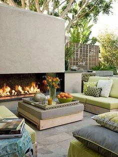
Phase B will consist of building an outdoor fireplace (will also act as a privacy screen) and bringing in plants.
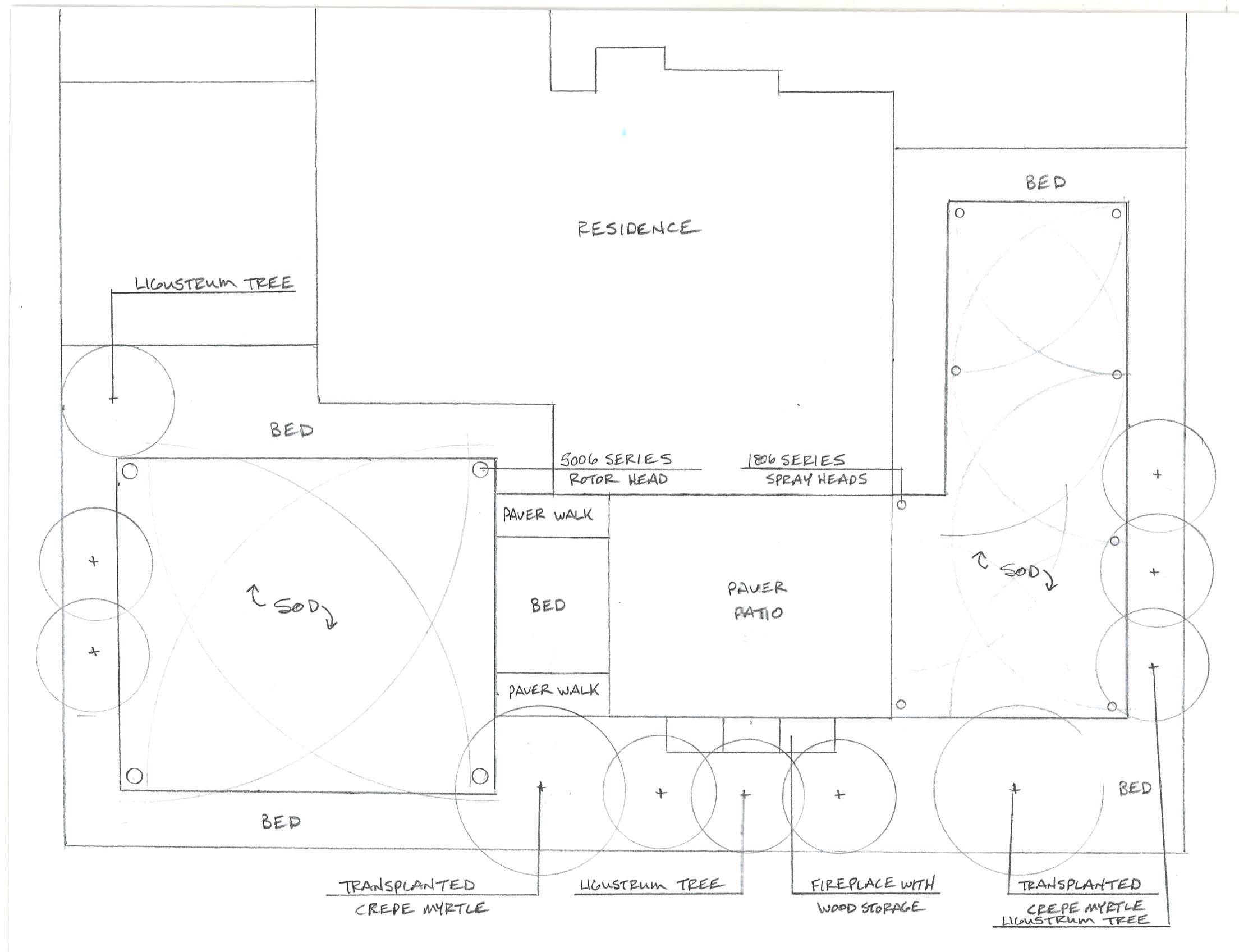
Drawing by Executive Landscaping
We hope the end result will be a beautiful space that can be used for entertaining. Some of the elements I would like to bring in are a dining area, an area for kids to play, a couple potted citrus trees, and a few raised beds for growing herbs and veggies.
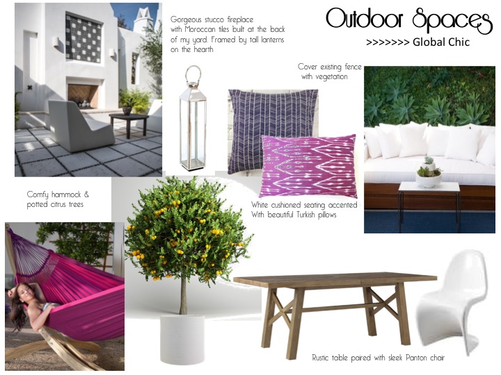
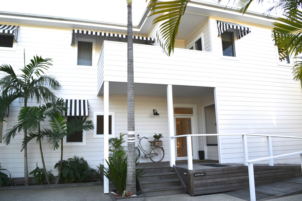
Originally inspiration board.
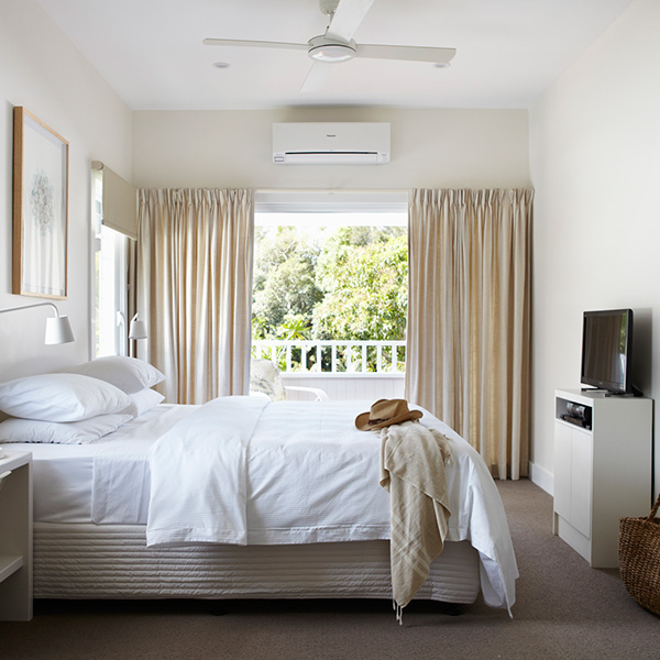
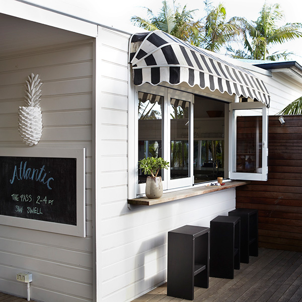
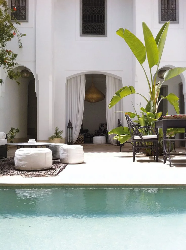
Here are some inspirational images I have been collecting:
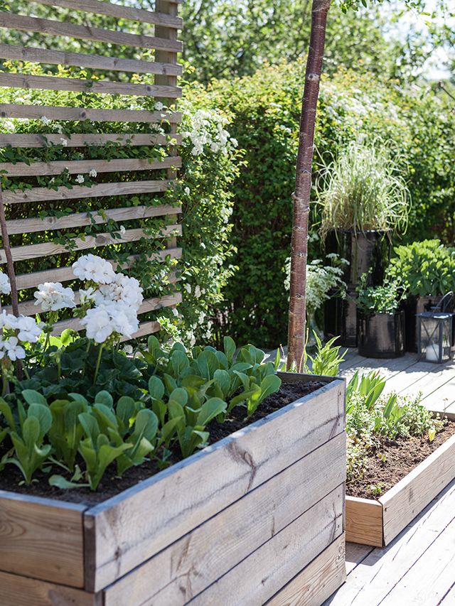
I like how they incorporated a raised bed with a trellis. It adds privacy while being functional too.
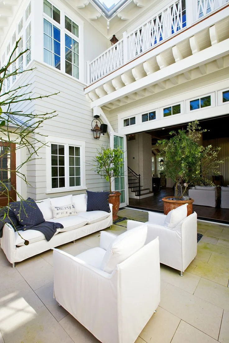
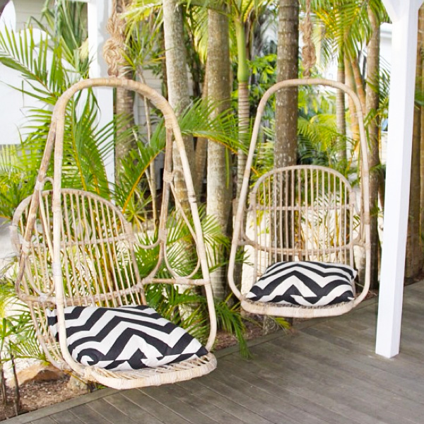
Image via Pizitz Home & Cottage
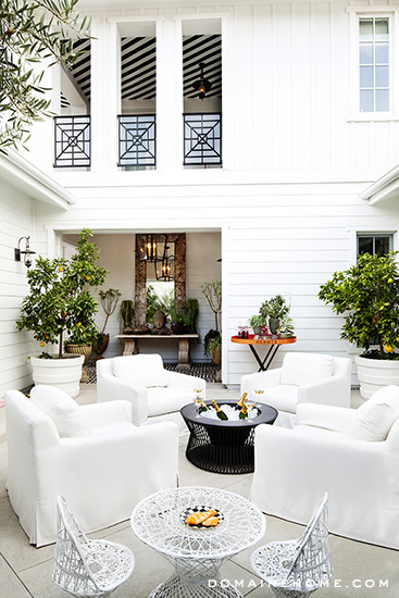
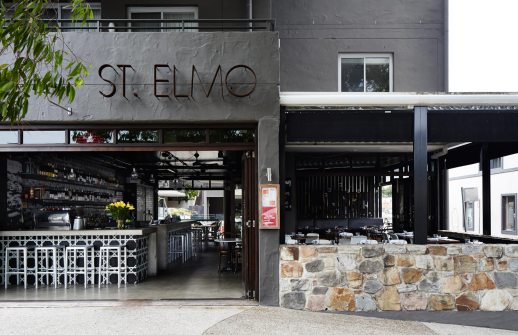
Kourtney Kardashian's patio for Domain Home.
Via Domaine Home
Hope to have some progress pics to share in a couple weeks.
Have a happy Hump Day!