Let's Take a Trip : Byron Bay, Australia
/I do not know about you all but I am so ready for SUMMER! This pale girl needs some sun. Did you know that in Australia their summer months are from December through February? As a destination on my bucket list, it would be so nice to escape to Australia right now.
From what I have seen online and heard from people who have visited, Australia is like California's cool cousin. The food, vibe, and designs are similar in many ways. So, let's pack our bags and head to the beach town of Byron Bay.
Byron Bay is located in the far-northeastern corner of the state of New South Wales, Australia. Lonely Planet describes Byron Bay as a relaxed funky town with a unique vibe, great surf, and fine food.
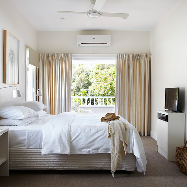
While in Byron, we will be staying at Atlantic Byron Bay which its website states is a unique coastal estate comprised of tropical gardens and three original beach cottages that have been transformed into Caribbean styled plantation houses.
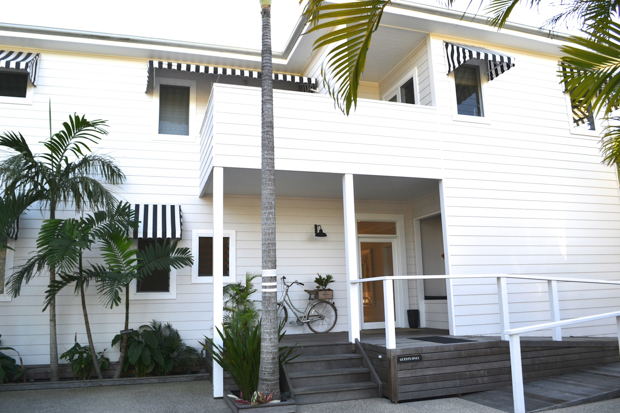
Image via a Hotel Life

Image via a Hotel Life

I believe I might have featured this kitchen before. The cement tiles on the island are one of my favs.
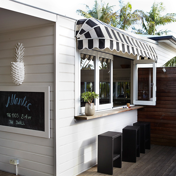
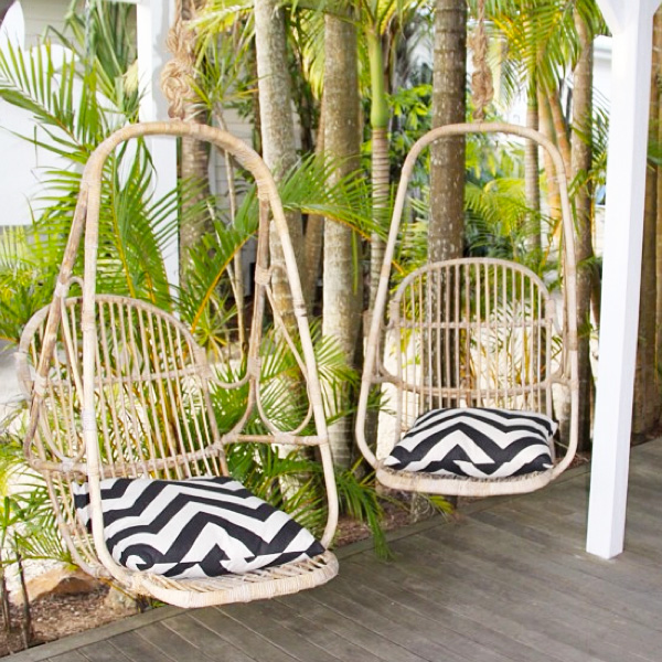
Love the simple design. The black and white color scheme is chic and allows the surrounding vegetation to take center stage. Even their trees are cool.

Painted stripes on tree trunks.


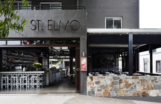
After a day of surfing and whale watching, it is off to St. Elmo's for Spanish tapas and wine.
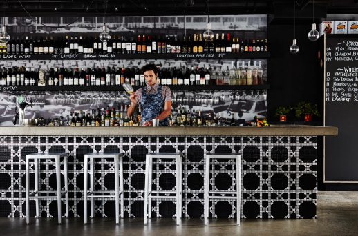
Check out that bar. Their wine list consists of over 100 different wines.
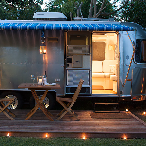
Then it is back to the hotel for some more wine and conversation under the stars.
Aaah, I feel relaxed already. If only.
Until next time, lovelies.